AVIATION | B2B WEB APP DESIGN

TripView at World Fuel Services

Project description

World Fuel Services (WFS) is a Fortune 100 company that solves energy challenges for customer fleets in aviation, land and sea, at more than 8,000 locations in over 200 countries and territories worldwide.

Background

The aviation side of the business was powered by legacy applications built on old technology, with no design input, and by different teams. This created a situation where pilots, flights dispatchers and support personnel were having a hard time navigating between different applications in the ecosystem to perform their day-to-day activities around trip planning and management. They were further slowed down by poor and inconsistent experiences across the various apps.

The Challenge

How might we design for a consistent, positive user experience that allows pilots and flight dispatchers to efficiently perform trip-related activities, while reducing operational and maintenance cost to the business?

My general process

Align the team around shared goals

Conducted interviews with key stakeholders and synthesized their input into a Lean UX canvas. I shared the finished artefact with the team, so that everyone was aligned with our collective goals and desired outcomes.

Understand the users' perspectives

Gleaned insights from previous research studies, conducted supplementary interviews with users, and developed personas and journey maps, so that the team could feel the biggest user pain points that a viable solution needed to address.

Set a new direction

Audited the existing legacy system to identify usability issues, prioritized features and mapped out the proposed experience based on research insights, considering the business goals and technical feasibility.

Explore within constraints

Considered several solution approaches with product, engineering and business partners with a focus on simplifying complexity, and ensuring platform and user fit.

Visualize in high fidelity

Designed the interfaces of various Trips features, with functional prototypes to communicate design solutions.

The project required input from various business, product and engineering stakeholders. As such, there were different levels of understanding about what the project entailed, and a number of suggested approaches, goals and outcomes.

As the lead designer on the team, I helped the team get on the same page by synthesizing all of the various stakeholder input into a Lean UX canvas.

As a result, the team was able to narrowly focus the project scope on one legacy system (TripView), where customers viewed and managed upcoming flight trips.

Align the team around shared goals

Align the team

Relying on past research work done, and conducting a few supplementary interviews with in-house flight support team members, we were able to better understand our users and their pain points.

The biggest pain point we validated was the lack of consistency and the inefficiencies across various apps in the ecosystem.

Understand the users' perspectives

To identify usability issues and opportunities for improvement, I audited the existing TripView user experience.

The audit exposed major issues around navigation, and surfaced an opportunity to connect fuel purchases to the trip planning experience so that users didn’t need to use multiple apps to perform these related tasks.

With these discoveries in mind, I proceeded to map out an improved experience with a focus on ease of navigation and efficiency in completing the most important/frequent user tasks.

Set a new direction

With the prioritized user goals and Information Architecture as an anchor, I iteratively explored and designed several solution ideas, with feedback from flight support team members informing design decisions.

With the prioritized user goals and Information Architecture as an anchor, I iteratively explored and designed several solution ideas, with feedback from flight support team members informing design decisions.

Explore within constraints

Solution

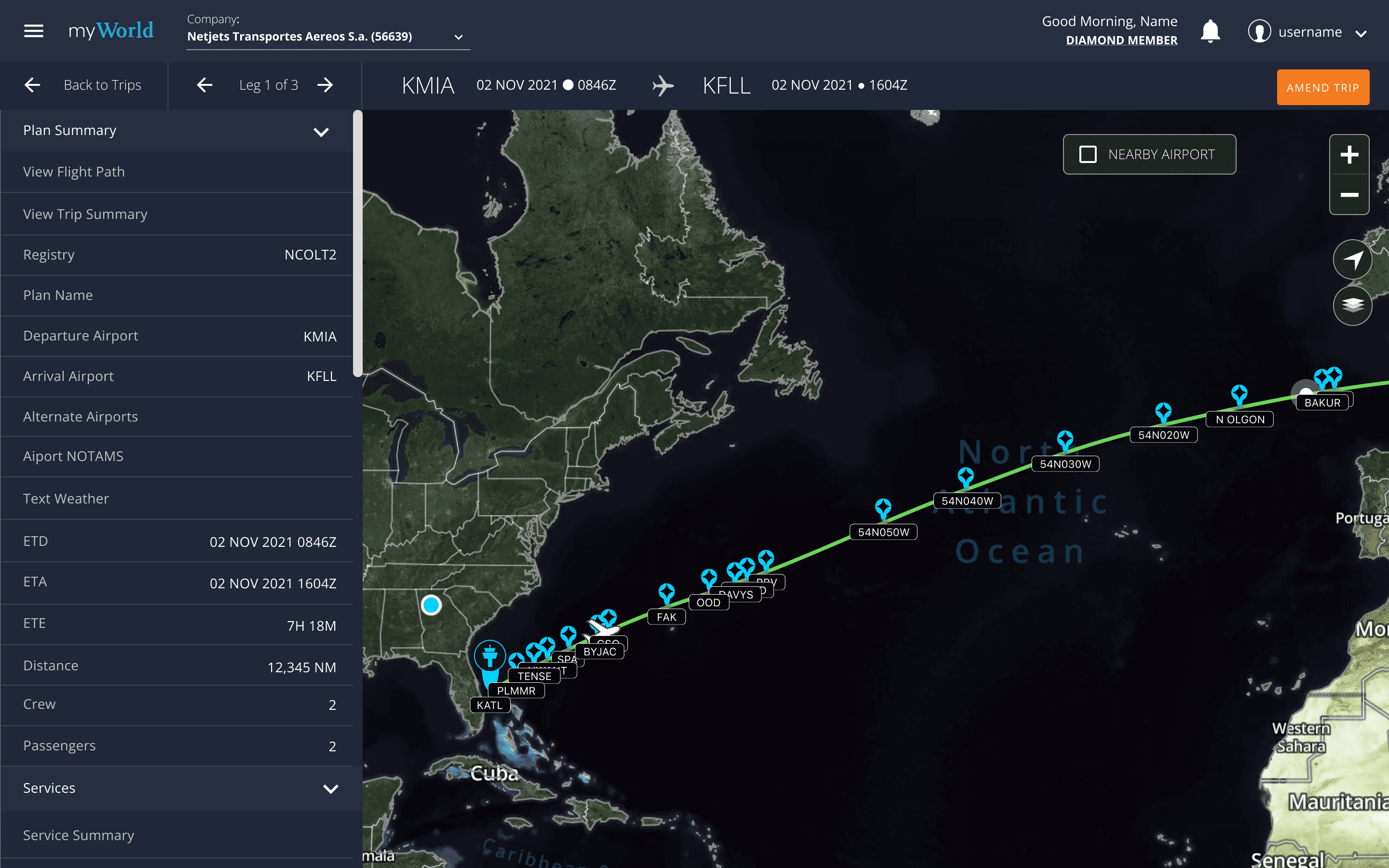
The resulting TripView app integrated into World Fuel Services' Business and General Aviation Platform (BGA) offered a cohesive, positive user experience, allowing pilots and flight dispatchers to more efficiently manage their flight planning and operations. Below are a few screens from the final design.

Platform Integration

Legacy system deprecated and features built into the the more modern Business and General Aviation (BGA) platform.

Intuitive Navigation

A completely redesigned Information Architecture centered around how pilots and flight dispatchers think and work.

Designed for efficiency

Legacy system complexity and barely used features stripped out of the new design, core user goals and tasks put within reach to increase efficiency.

  • TRIPS LIST VIEW

    All upcoming trips in one place, with related trip information grouped together for easier comprehension and the status of each phase of the trip planning process clearly shown.

  • TRIPS MAP VIEW

    See more detail on the flight path for each leg of the trip. Largest real estate given to the map so that users can view as much information as possible before zooming.

  • TRIPS LIST VIEW (BEFORE)

    Poor navigation, limited/irrelevant trip information occupying important real estate.

  • TRIPS LIST VIEW (AFTER)

    All upcoming trips in one place, with related trip information grouped together for easier comprehension and the status of each phase of the trip planning process clearly shown.

  • TRIPS MAP VIEW (BEFORE)

    The map (flight path), which is the major reason users navigate to this screen, os not given priority making it difficult for users to obtain the information they need.

  • TRIPS MAP VIEW (AFTER)

    See more detail on the flight path for each leg of the trip. Largest real estate given to the map so that users can view as much information as possible before zooming.

Results

Results

Results

I do not, at this time, have hard data on the outcomes of this project once it was launched in the wild. However, testing prior to launch showed users spent less time confused and stuck in a navigation maze. This greatly improved productivity and efficiency, so that we could reasonably infer a more positive experience for the user and lower customer support costs for the business.