AUTOMOTIVE | 0-1 B2B WEB APP DESIGN

Electric Vehicle Suitability Assessment at Geotab

Project description

Geotab is a global leader in connected vehicle and asset solutions, leveraging advanced data analytics and AI to enhance fleet performance, safety, and sustainability while optimizing costs.

The Problem

Commercial and government vehicle fleets are looking to replace their conventional vehicles with electric vehicles (EVs) but are not sure whether this transition would help them save money, or if EVs would suit their current operations and sufficiently reduce their carbon footprint.

Our Solution

We set out to create the Electric Vehicle Suitability Assessment (EVSA) application, an easy-to-use tool to help fleet managers determine the viability of replacing their current fleet vehicles with EVs.

My Role

I led and worked on all aspects of the design of this new product, including design strategy and principles, interaction, UI design, and usability testing. I also collaborated with the product manager on defining and measuring success metrics.

Our general process

Design a framework for collaboration

Worked with the team to define how we may best work together to ensure efficiency and alignment.

Validate the problem

Led by the product manager, we undertook discovery to validate the problem was worth solving at this time.

Scope the solution

Led by the product manager, we undertook solution validation interviews to figure out what possible features and functionality would make for a viable first release.

Define the design strategy

With a focus on user and customer goals, I established a design direction, getting alignment with the team throughout the process.

Design the interactions

Led the end-to-end interaction and visual design, iterating as I received feedback from the team.

Test the solution

Conducted usability testing sessions with users to ensure that the product met user expectations and was easy to use.

Release and monitor

Released the first version of the product and monitored user adoption, collecting feedback for improvements.

As the first designer on the team, hired specifically for this new product, I initiated and worked with product management to design a framework for collaboration between product managers and designers, clearly showing phases, roles and responsibilities. This helped us work and support one another better.

As the first designer on the team, hired specifically for this new product, I initiated and worked with product management to design a framework for collaboration between product managers and designers, clearly showing phases, roles and responsibilities. This helped us work and support one another better.

Design a framework for collaboration

Design a framework for collab

Prior to me joining the team, the product manager had conducted customer discovery interviews to help the team better understand why vehicle fleets were looking to go electric, the barriers that made the transition difficult, and what the team might do to eliminate those barriers and help fleets achieve their goals.

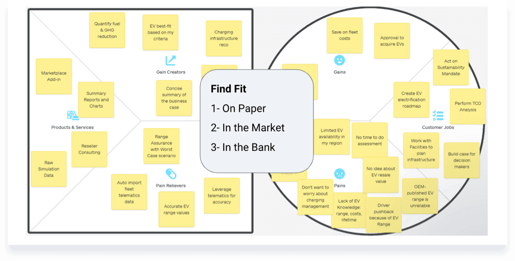
Using insights from those interviews, he created a value proposition canvas showing the customer jobs-to-be-done, their pains and gains, and possible pain relievers and gain creators.

Validate the problem

The product manager had also conducted solution validation interviews with customers, using functional wireframes to test out several solution ideas and concepts. The tests gave the team a better sense of what functionality resonated with customers and what functionality did not.

The product manager had also conducted solution validation interviews with customers, using functional wireframes to test out several solution ideas and concepts. The tests gave the team a better sense of what functionality resonated with customers and what functionality did not.

Scope the solution

Through the problem and solution validation research, the product manager had established that the problem was worth solving. I knew I needed to build on this to provide a more unified understanding of who we were solving the problem for, and set the direction for what a satisfactory solution could be like.

After listening to, and making notes from, hours and hours of interview recordings, I synthesized customer behavioural archetypes, an overarching user story, high level design requirements and design principles that would serve as anchors for the design solution going forward.

Define the design strategy

Guided by the design strategy, we arrived at a solution where the product would guide the user step-by-step through the EV comparison and evaluation process. This approach, we believed, would make navigation easy and reduce the mental effort required to complete the process, ultimately helping users accomplish their goals faster.

Following that I mapped out the steps users would take within the product to compare their current fleet vehicles with EVs. This mapping surfaced gaps in our knowledge, as well as assumptions and questions we had failed to consider.

Design the interactions

With the interaction and UI designs complete, I conducted usability tests with 10 representative users.

Although several issues were uncovered, the EVSA did better than we had expected, achieving a System Usability Scale (SUS) score of 79.

With the interaction and UI designs complete, I conducted usability tests with 10 representative users.

Although several issues were uncovered, the EVSA did better than we had expected, achieving a System Usability Scale (SUS) score of 79.

Test the solution

Prior to launch, the product manager and I decided on and documented UX metrics (using Google’s HEART framework) that we would measure and monitor for product success. These metrics would help inform future iterations of the product.

The EVSA was launched, first in Europe and then in North America, to happy and satisfied users. It has gone on to do great things for our business, helping the company attract new customers, especially in Europe where commercial EV adoption is much higher.

Release and monitor

Solution

The resulting Electric Vehicle Suitability Assessment (EVSA) app was a tool that guided the user step-by-step through the EV evaluation and comparison process, showing them where in made sense from a financial and environmental perspective to replace their conventional fleet vehicles with electric vehicles.

Trust over everything

The core design principle guiding how we built the product was around building user trust through accuracy and transparency.

Direction over choice

Because EV evaluations for vehicle fleets were new for the industry we favoured guiding users through a narrowly define set of options/paths to reduce confusion and increase efficiency.

Function over form

This was a strictly business tool, so that while we cared that it looked good, our priority was to make sure it did job required by users well.

  • HOME SCREEN

    Home screen where users begin their assessment

  • ANALYSIS SUMMARY SCREEN

    EVSA analyzes input and provides summary results

  • HOME SCREEN

    Home screen where users begin their assessment

  • TELEMATICS DATA SCREEN

    User selects telematics data period to be used in the evaluation

  • VEHICLE SELECTION SCREEN

    User selects fleet and electric vehicles to evaluate

  • ANALYSIS SUMMARY SCREEN

    EVSA analyzes input and provides summary results

  • RECOMMENDATIONS SCREEN

    Detailed vehicle-by-vehicle breakdown and recommendations