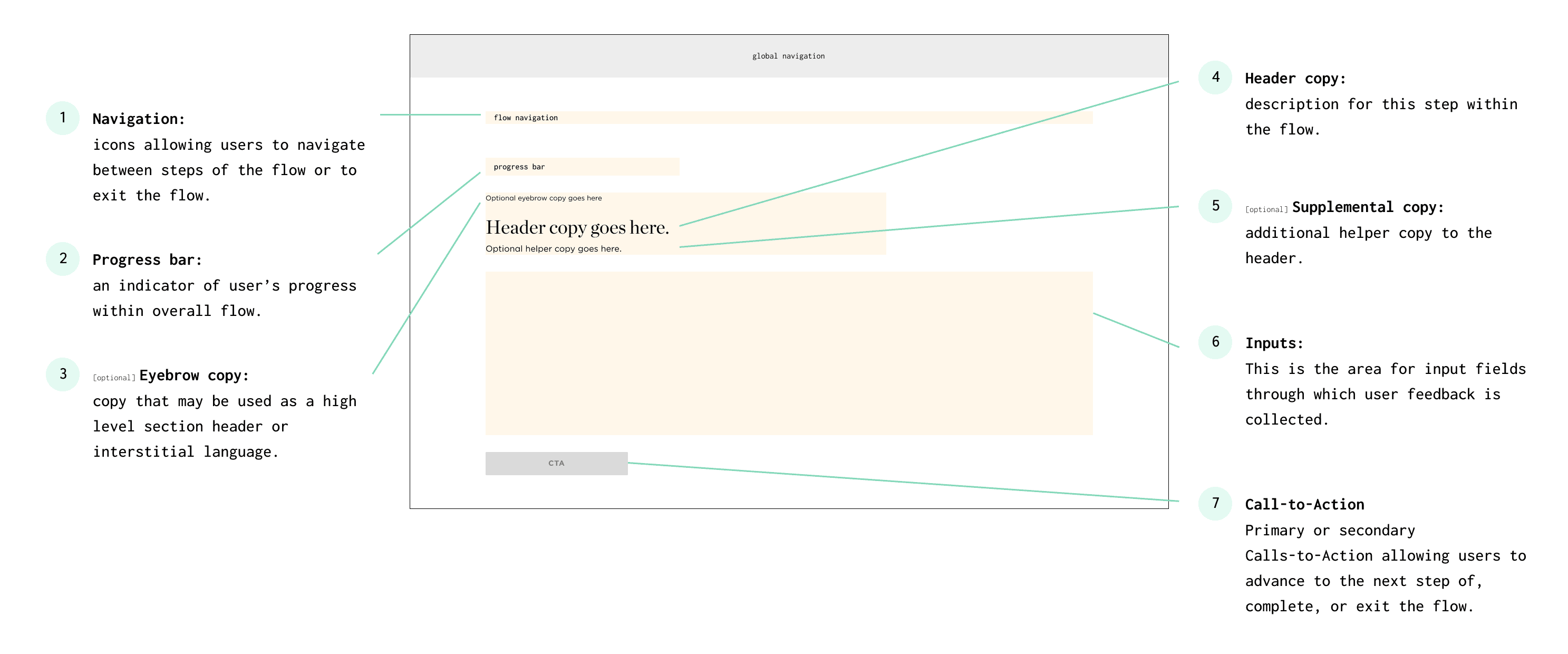
An auto insurance lead flow redesign and optimization that led to a 60% increase in conversion
Conversion Optimization
Product Design
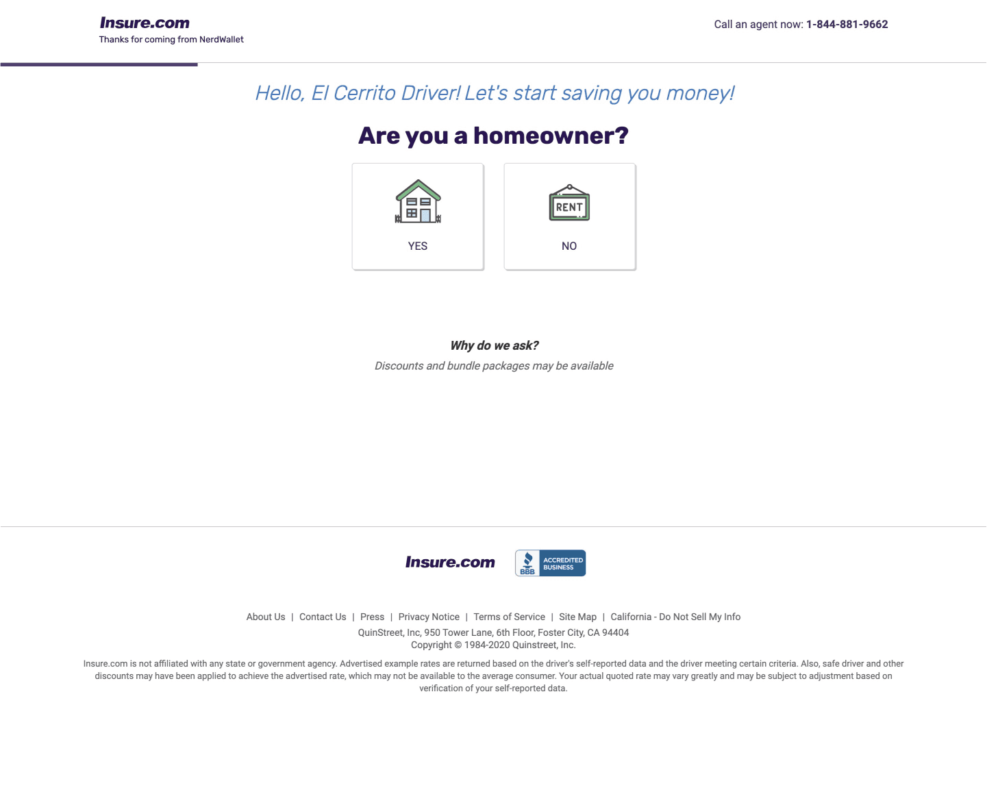
NerdWallet previously used a Quinstreet-powered experience that matched users with insurance carriers through blind lead matching, after collecting users' personal information. It also let users click out to carriers who paid per click, generating over 95% of the Auto Insurance vertical’s revenue. NerdWallet’s goal was to build its own shopping experience on its domain to eventually replace Quinstreet.
Below is a sample of what the Quinstreet version looked like. Or, better yet, watch the video walkthrough to get a fuller sense of the experience. It takes a minute at 2x speed.
One big problem with the Quinstreet flow was that users had to enter the same personal info twice, first on Quinstreet, then again on the insurance provider’s site. Not surprisingly, that caused a lot of people to drop off.
So the initial goal of this project was to recreate that flow on NerdWallet’s domain, but with a key improvement: pre-fill the user’s info on the provider’s site to save time and reduce drop-offs.
Pretty simple, huh? Well, if there’s one thing I’ve learned in my years as a product designer: if it's simple, you're probably doing it wrong.
As I went through the Quinstreet flow myself, I had a hunch there were more friction points causing users to drop off, not just the repeated form filling. To dig deeper, I reached out to the data team for analytics, but since Quinstreet owned the data, they weren’t willing to share it.
So instead, I teamed up with our UX researcher to run user interviews and usability tests using the Quinstreet flow. We wanted to see firsthand how people shopped for auto insurance and where they were getting stuck.
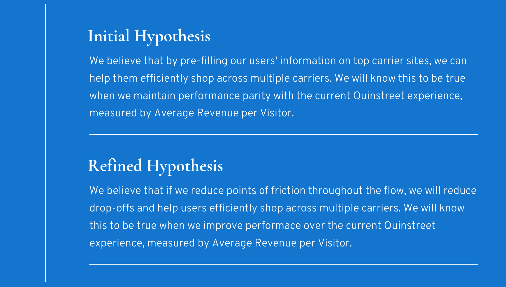
Turns out, some of my suspicions were correct. There were more friction points than just the duplicate forms. There was a high risk of drop-offs when users were asked to provide their date of birth and other personally identifiable information. It became clear we needed to think bigger. I shared our findings with stakeholders, and eventually got buy-in to expand the project scope: not just pre-fill user info, but also rethink and improve the entire flow.
Below, you’ll see how we refined our original hypothesis based on those insights.
Audit and Competitor Review
With a clear hypothesis in place, I took a closer look at the Quinstreet experience, as well as the experience of competitors in the space, to see what wasn’t working and where we could improve. Below are some of the bigger issues that stood out.


Reimagine the flow
By this point, I had a much clearer idea of what needed to change in the flow. I pulled together my thoughts and shared them with the team as a set of optimization criteria to help guide our next steps. Here’s what we focused on:
Set the right expectations upfront so users know what they’re opting into.
Guide users through the flow in a coherent and logical manner; avoid confusion.
Maintain trust, especially with PII.
Improve back and forth navigation compared to the Quinstreet experience.
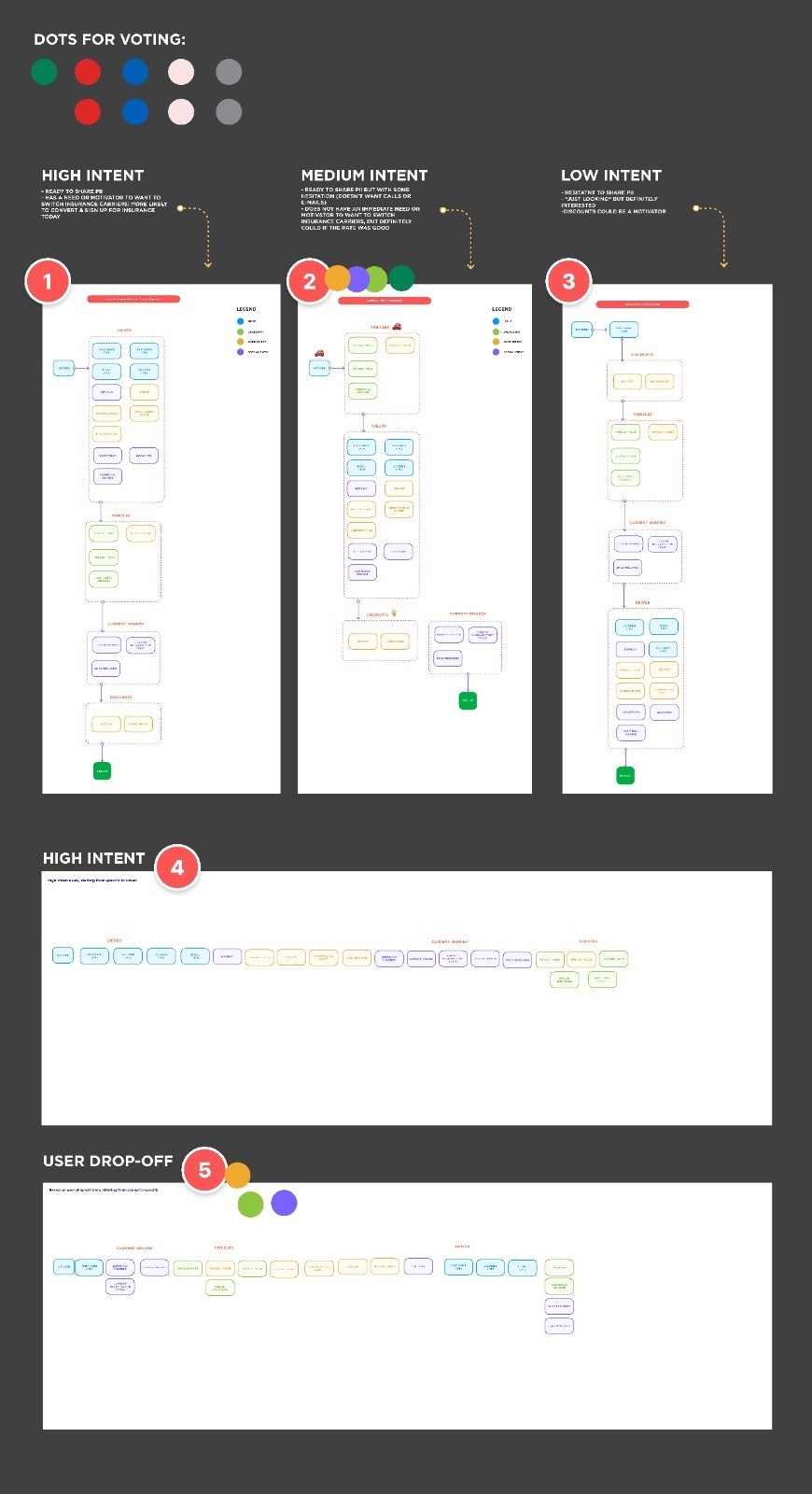
With the criteria set, I mapped out several flow options tailored to our different user groups. Then I ran a workshop with the team where we dot-voted to choose the best option to move forward with, for our initial A/B test.
High fidelity design
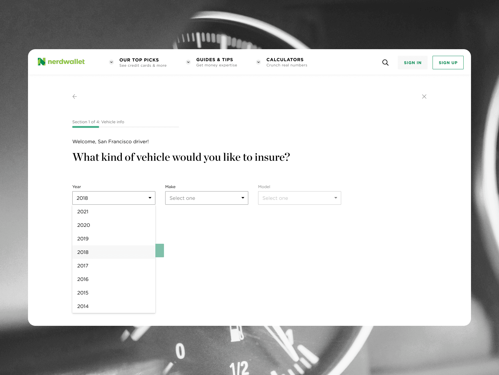
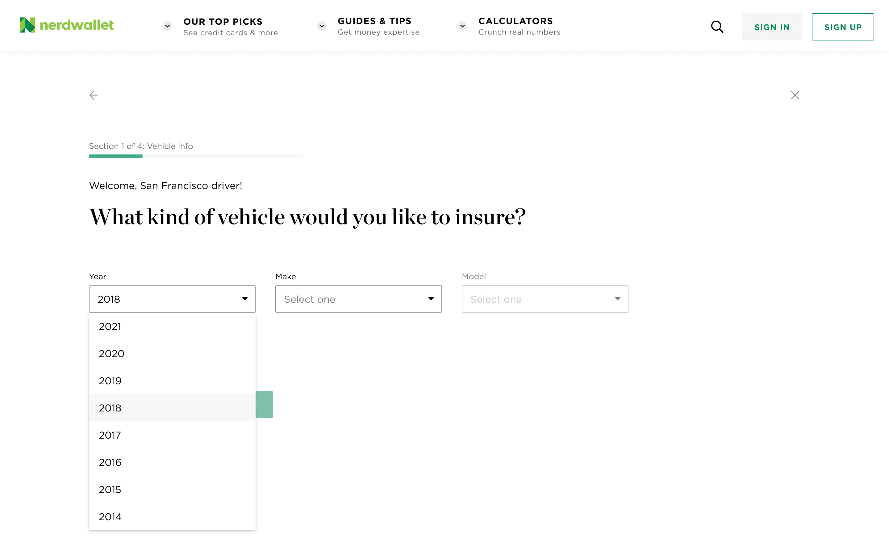
Once we locked in the flow, I created mockups for the templates and question order, building on the existing components in the NerdWallet design system. In addition to the initial goal of pre-filling user information on the insurance providers' websites, as we designed, we kept a few key things in mind:
Logical question order
We shouldn't begin the flow with a question about home ownership, like in the Quinstreet version. This didn’t make much sense for users shopping for car insurance. Instead, we decided to kick things off with questions about their vehicle. That way, users would feel reassured right away that they were in the right place.
Gain trust with PII
We also made sure to set the right expectations early by letting users know we’d be collecting some personal information, and explaining why. This helped build trust, reassured them they wouldn’t be spammed, and made them more likely to continue through the flow.
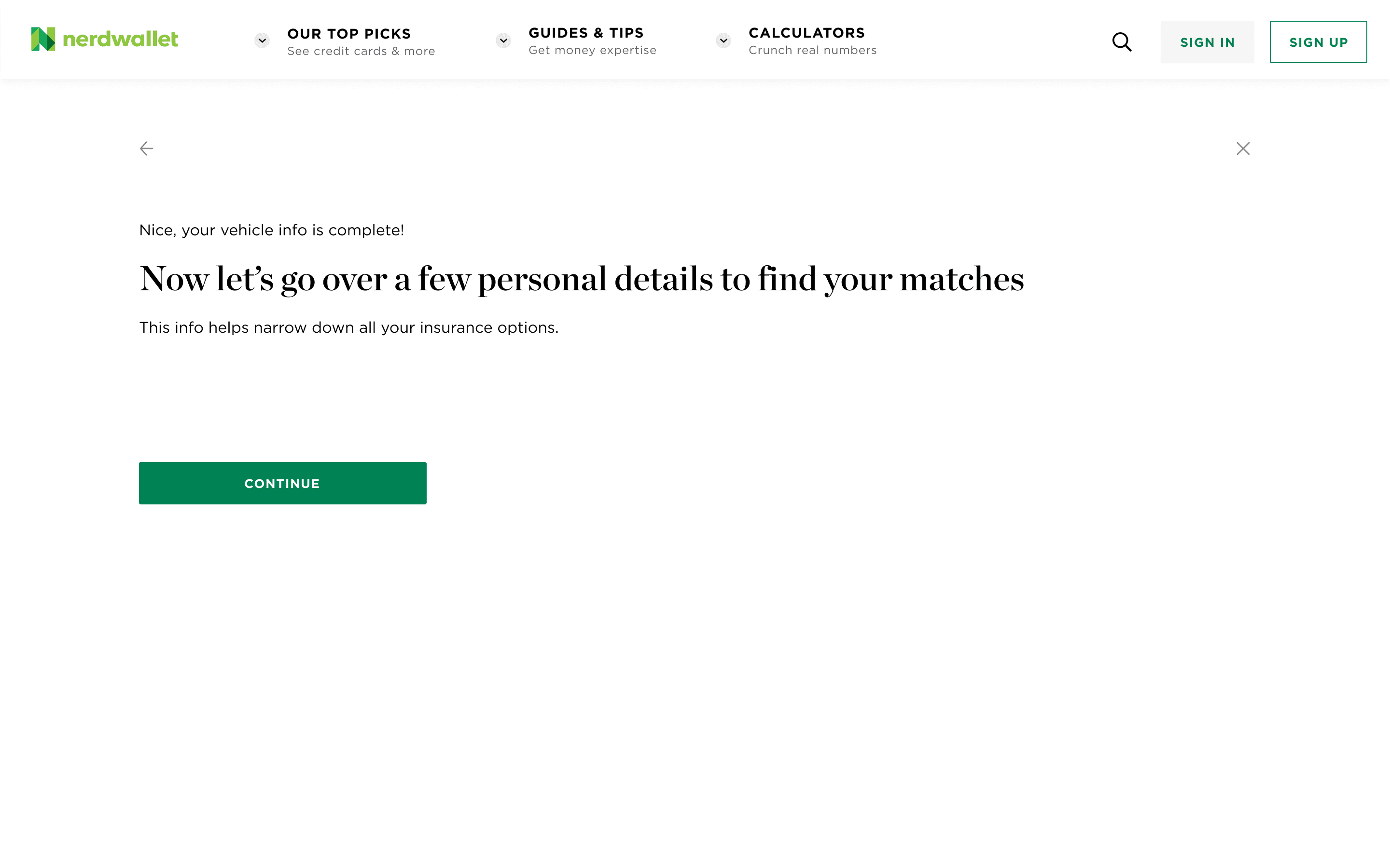
Move PII questions up the flow
In the Quinstreet version, the driver information questions came at the very end, understandably since they carry the highest risk of drop-off. But for NerdWallet’s marketing needs, that data was important. So, we decided to move those questions earlier in the flow. Our thinking was that, since we were targeting users with relatively high intent and clearly explained why we needed the info, the risk of drop-off would be low enough to justify the change.

A/B test and optimize
We built and launched the NerdWallet version to a subset of users to test against the Quinstreet version. To our delight, it performed significantly better. However, there was room for some improvement. It turned out that moving the PII questions up the flow was a mistake, as was the interstitial explaining to users why we needed their information. I decided to reorder the questions based on the early test data and move PII questions to the end of the flow.
You can compare the original and optimized flows here and the basic flow template I created below.
Increase in ARPV
After launch, we saw a 60% boost in conversions, measured by users who not only reached the results page but also clicked through to the insurance provider’s site. If everything else stayed the same, this would translate to a 20–30% increase in Average Revenue per Visitor.
Standardized template
Because of the success of the project, the template was added to NerdWallet's design system and rolled out across other insurance products.