
Trip View
As lead designer, I consolidated four legacy flight-ops apps into one consistent Trips experience for business aviation, and pulled fuel purchasing into trip planning. The MVP shipped.
At a Glance
| Timeline | 2022 · 3 to 6 months |
| Role | Lead / Sole Product Designer (discovery to handoff) |
| Team | Cross-functional: Product, Engineering, Customer Support, and Business (PM led MVP scope) |
| Platform | Web (desktop) |
| Domain | Business and General Aviation, flight operations (World Fuel Services) |
| Outcome | Shipped MVP: four legacy apps consolidated into one consistent Trips experience, with fuel purchasing built into trip planning |
Overview
Pilots and flight dispatchers at World Fuel Services had to move between four separate legacy apps to plan and manage a single trip, each built by a different team with no design input and an inconsistent experience. As lead designer, I led the work to bring the most important trip-planning tasks into one consistent Trips experience inside the Business and General Aviation (BGA) platform, and to connect fuel purchasing directly to trip planning so users no longer had to leave to buy fuel. The MVP shipped, replacing a fragmented toolset with a single, scannable place to see every trip, its status, and its details.
My Role & Ownership
Owned
- End-to-end design from discovery to engineering handoff, as the lead and only designer
- Synthesizing stakeholder input into a Lean UX Canvas to align the team
- Research synthesis into personas, journey maps, and a prioritized set of user goals
- The information architecture for the unified Trips experience
- Iterative interface design and functional prototypes for the MVP features
Influenced
- Reframed the work from four disjointed apps toward one consistent trip experience
- Surfaced the opportunity to pull fuel purchasing into trip planning, a cross-app win
- Helped a divided group of stakeholders converge on shared goals and outcomes
Collaboration
- PM, who led MVP scope from the prioritized user goals
- Engineering on feasibility and technical constraints
- In-house flight support team members, for user input
- Business and customer support stakeholders on goals and requirements
The Problem
World Fuel Services serves aviation customers at more than 8,000 locations across 200+ countries. On the aviation side, trip planning ran on a patchwork of legacy apps (Online Flight Planning, Falcon, myWorld iPad, and TripView), each built on old technology by a different team with no design input. To plan and manage one trip, pilots, dispatchers, and support staff had to move between several of these apps, each with its own dated and inconsistent experience. That slowed people down and cost the business to maintain.
I framed the work around a single question the team aligned on:
The question we aligned on
“How might we design a consistent, positive experience that lets users efficiently perform trip-related activities, while reducing operational and maintenance cost to the business?”
Before and After
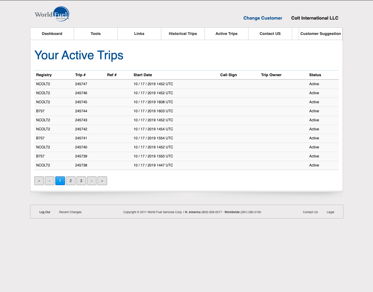
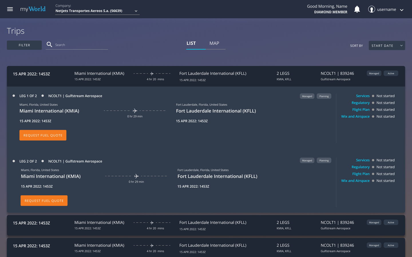
The shift is clearest at the level users feel first: the Trips list. The legacy TripView buried trip status in a dense table, with columns out of priority order and empty fields wasting space. The redesign makes each trip a scannable card, status set apart and the most important details first. How I got there is below.
The Trips list, before and after

How I Got There
Here is how I got from four disjointed apps to one Trips experience.
Developing a shared understanding
This was a large, cross-functional effort, and the stakeholders did not start aligned. People from business, customer support, product, and engineering each had a different idea of what the project was and what success looked like. Before designing anything, I interviewed key stakeholders and synthesized their input into a Lean UX Canvas, then shared it so the team agreed on goals and outcomes. On a project this broad, that shared artifact is what keeps later decisions from relitigating the basics.
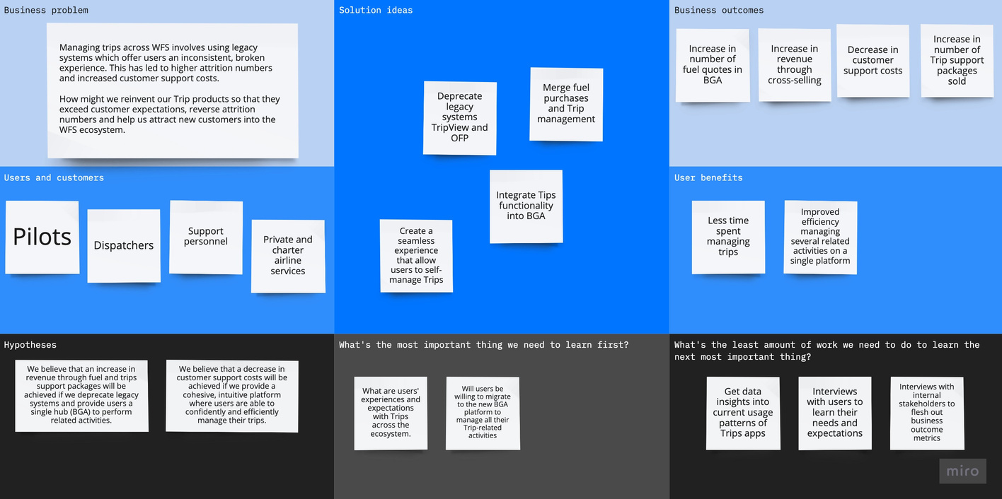
Lean UX Canvas synthesizing stakeholder input
Getting the users' perspectives
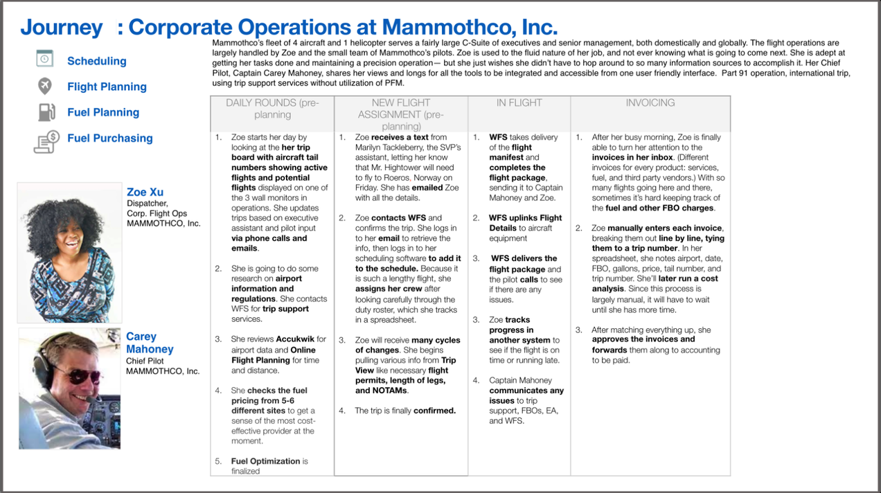
Customers fell into two groups by size: local/national and global/international air charter services. The business prioritized global/international charter companies for v1, because they were the ones most likely to buy Trip Support packages, a major source of revenue. Drawing on prior research and supplementary interviews with in-house flight support staff, I built personas, journey maps, and a prioritized set of user goals, so the team could feel the pain points a viable solution had to address.
Persona and journey

Scoping and auditing the current experience
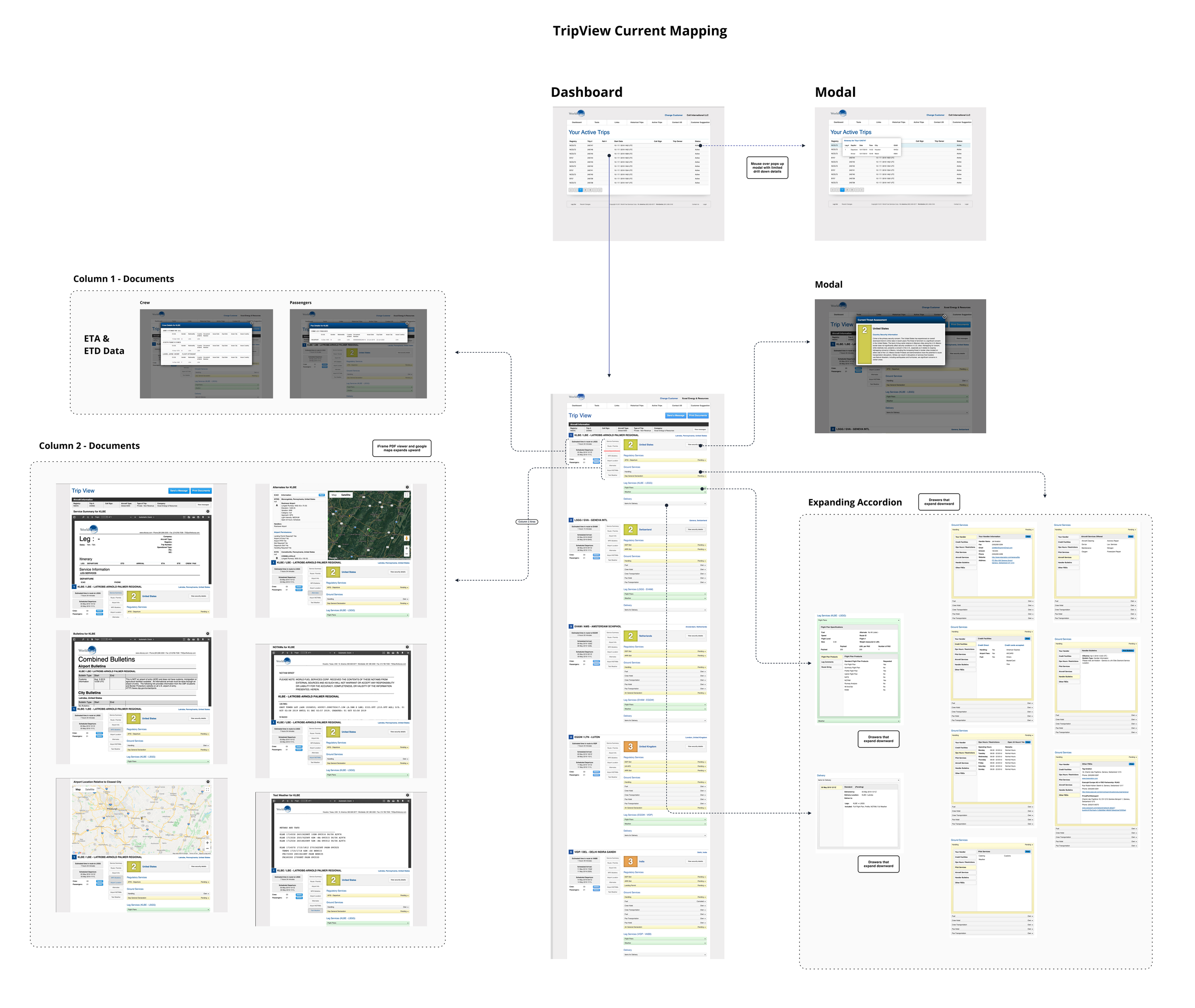
Led by the PM, the team set the MVP scope from the prioritized user goals. Of the four trip apps, TripView was where most of the primary persona's goals were already met, so I mapped and audited its experience to find the gaps. The audit exposed major usability problems in navigation and information architecture, and one clear opportunity: connect fuel purchases to trip planning so users no longer needed a separate app. I used that to map a new information architecture, focused on easy navigation and efficiency for the most frequent tasks.
The audit and the new IA
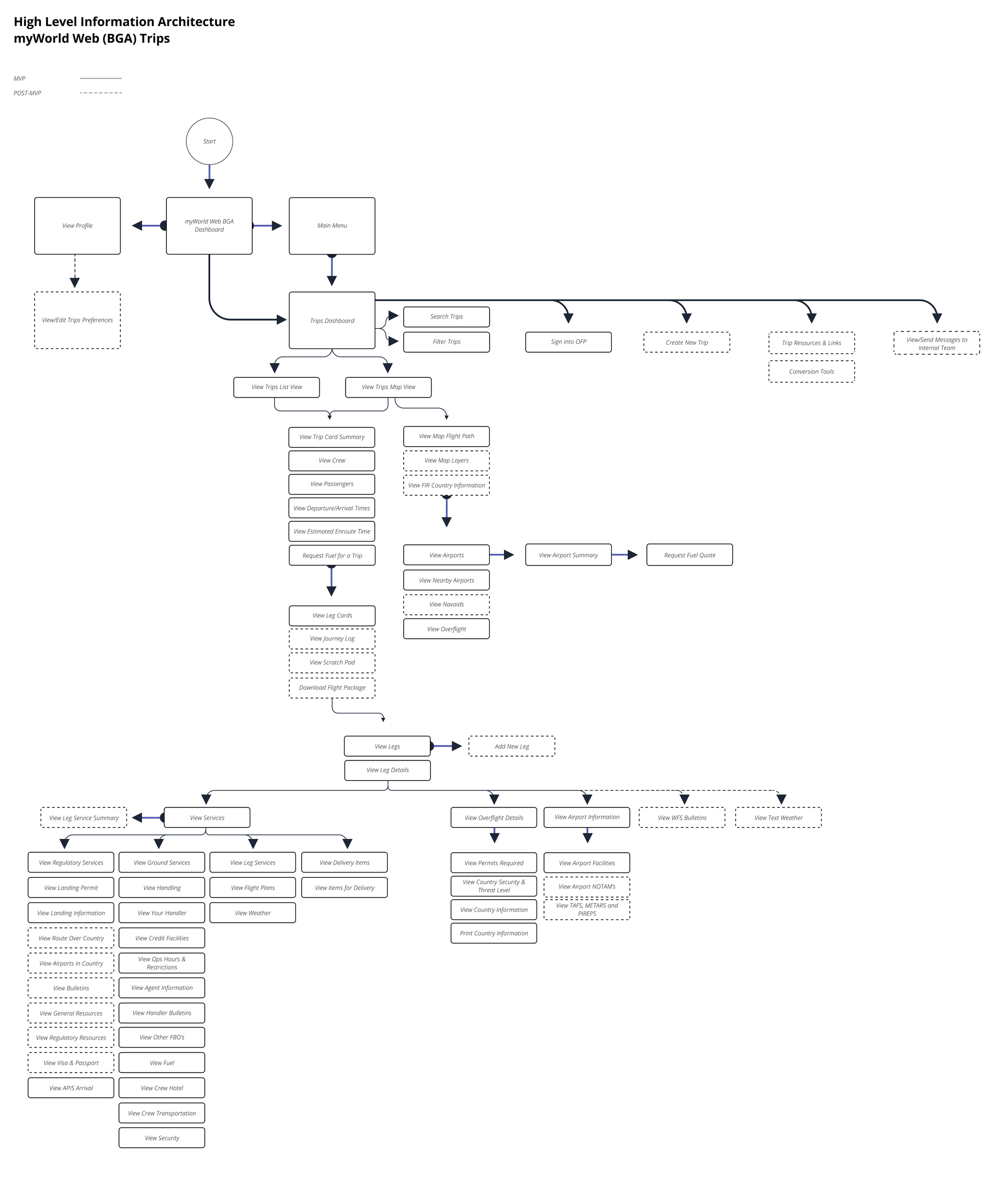
Designing the interface
With the prioritized goals and the new IA as the anchor, I designed the MVP interfaces iteratively, with feedback from flight support staff. The Trips list, shown above, is where the decisions read most clearly. The legacy table treated status, a top user goal, like every other cell, ordered columns without regard to importance, and kept empty fields such as "Call Sign" and "Trip Owner." My first pass reordered the columns by importance and replaced the empty ones. The final version moved from a table to cards, because cards are more scannable and make each trip read as a distinct object a user can act on, with related details grouped and status set visually apart.
The Solution
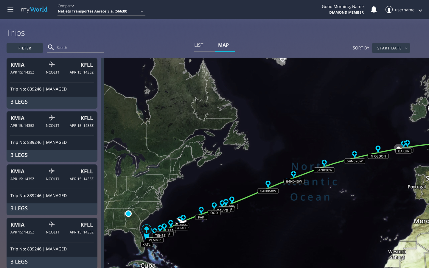
The result brought the most important trip-planning tasks into one consistent Trips experience inside the BGA platform, and pulled fuel purchasing, previously a separate app, into the flow so users could request a fuel quote without leaving their trip. Here are the key screens.
Key Screens
Impact
The MVP shipped, replacing four fragmented legacy apps with one consistent Trips experience for pilots, dispatchers, and support staff. Trips, their status, and their details now live in a single scannable place, and fuel purchasing, which used to mean leaving for another app, happens inside the trip.
I don't have post-launch metrics to share. The qualitative result is the point: a dated, inconsistent set of tools became one coherent product, which is the consistency-and-efficiency goal the project set out to hit, and a smaller surface area for the business to maintain. The more durable contribution was structural. A Lean UX Canvas and a shared set of prioritized user goals aligned a fragmented group, and a new information architecture connected two things, trips and fuel, that the old tools had kept apart.