Insurance Pre-Fill Flow
I led the design of a NerdWallet-native auto-insurance shopping flow that replaced a clunky third-party experience. It shipped on desktop and mobile and beat the incumbent on revenue per visitor by 20%.
At a Glance
| Timeline | Q1 2021 launch, with post-launch optimization through Aug 2021 |
| Role | Sole / Lead Product Designer (discovery to handoff) |
| Team | 1 designer (me), PM, UX Researcher, Content Designer, Engineering, plus 10+ cross-functional stakeholders |
| Platforms | Desktop and mobile web |
| Outcome | Shipped · 60%+ conversion · ARPV +20% vs. Quinstreet · Template scaled across NerdWallet insurance products |
Overview
NerdWallet's auto-insurance shoppers were sent to a third-party Quinstreet experience the company didn't control, where a confusing question order and repeated data entry cost both conversions and trust. As the sole designer, I led a NerdWallet-native pre-fill flow that asks the right questions in the right order, earns trust before requesting sensitive information, and hands a complete profile to top carriers, so people can compare 2 to 3 of them in far less time, without the repetitive data entry and frustration that pushed them away before.
My Role & Ownership
Owned
- End-to-end design from discovery through engineering handoff, as the only designer on the initiative
- Competitive and existing-state analysis (Quinstreet, Insure.com, and ~13 competitor flows)
- Flow strategy: question sequencing, intent-based segmentation, and the experiments to test them
- A reusable question-template system built on NerdWallet's design system
- Desktop and mobile interaction and visual design
- Post-launch optimization: reordering the flow based on A/B testing and early drop-off data
- Driving the question-template into NerdWallet's design system for reuse beyond this project
Influenced
- Expanded the brief from a narrow pre-fill task into a full native redesign, reframed around earning trust through sequencing and brand
- Set the bar for how PII-heavy NerdWallet flows handle expectation-setting and progress
- Defined the question and data model around carriers' prefill and bidding requirements
Collaboration
- PM on scope, hypotheses, and success metrics (ARPV)
- UX Researcher on interviews and usability testing of the existing flow (researcher-led; I contributed to synthesis)
- Content Designer on copy and the trust messaging shown before sensitive questions
- Engineering on prefill feasibility, persistence, and carrier integration constraints
- Business Development, Category, Content, CRM, Performance Marketing, Biz Ops, User Ops, and Legal on requirements and risk
The Problem
NerdWallet's auto-insurance vertical earned roughly 95% of its revenue through a third-party experience powered by Quinstreet, branded as Insure.com. Because NerdWallet didn't control it, the company couldn't fix its usability problems, and Quinstreet ordered the results by who bid highest rather than by the best deal for the user. Two things were quietly costing us:
What it was costing us
- The question order didn't match how people think. The existing flow opened with questions like "Are you a homeowner?" before establishing why it was even asking. That is a jarring start for someone who came to shop for car insurance.
- It threw away trust and known data. The hand-off looked like a different company, and members had to re-enter information NerdWallet already had.
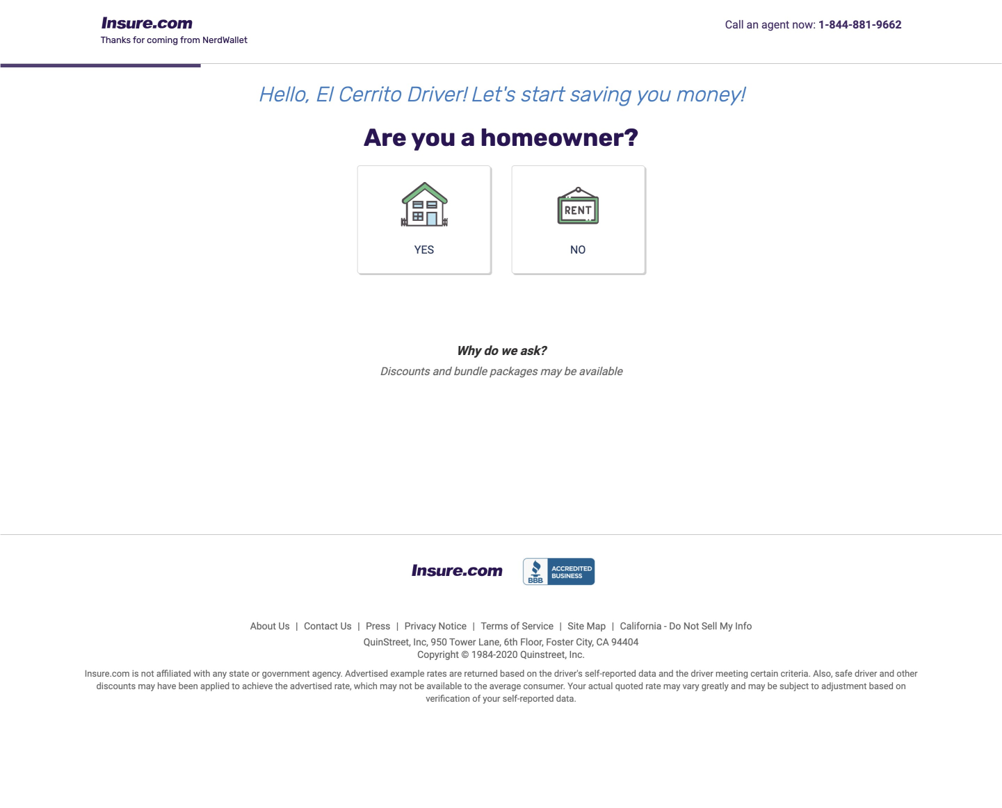
The existing Quinstreet flow, opening on an off-topic question
Reframing the Brief
The brief I was first handed was narrow: recreate the Quinstreet flow and pre-fill known fields to cut duplicate data entry. After walking the flow myself and tearing down competitors, I argued that pre-fill alone wouldn't fix the deeper problems, and got the scope widened to a full, NerdWallet-native redesign.
I framed the work around a single question the team aligned on:
The question we aligned on
“How might we help Eddie efficiently shop across 2 to 3 top carriers so he can make a decision about the best auto insurance policy for him?”
The hypothesis
The hypothesis was simple. If we pre-fill a member's information and ask for the rest in a coherent, trustworthy order, we can match or beat the current experience on performance, measured by ARPV (average revenue per visitor).
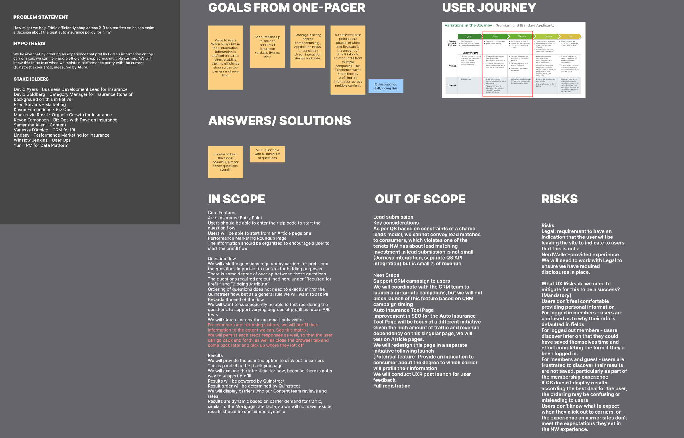
Problem statement, hypothesis, scope, and risks
Setting the bar
Setting the bar at "performance parity" sounds modest, but it was deliberate. It gave us a clear, falsifiable target and forced honesty about risk. I documented the UX risks up front, including users being uncomfortable sharing PII, confusion when fields are pre-filled, and frustration that results aren't saved, so the team designed against known failure modes from the start.
Designing for Eddie
The primary user was "Thriver Eddie," a NerdWallet member archetype. He is a 37-year-old enterprise sales manager, married with two kids, financially comfortable and optimizing rather than scrambling. His most relevant frustration: "having to log into multiple platforms to check all his account balances." Eddie doesn't want to do the legwork. He wants NerdWallet to do it for him.
That pointed straight at pre-fill as the core value. Every field we could fill for Eddie was a moment we respected his time and reinforced that NerdWallet was working on his behalf.
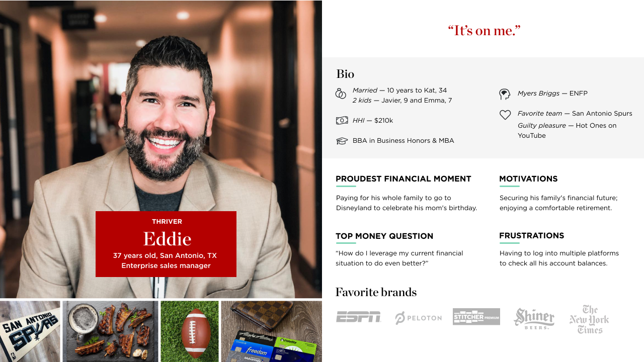
Thriver Eddie persona
Learning From the Market
Before designing anything, the team grounded the work in evidence rather than assumptions. Our UX researcher ran interviews and usability tests on the existing Quinstreet flow, sessions I helped synthesize. They confirmed the problems went past duplicate data entry: people dropped off when asked for PII without context, and the question order felt illogical to them. My own deep dive was the competitive teardown.
I audited roughly a dozen flows (Zebra, Progressive, Insurify, Gabi, ValuePenguin/LendingTree, Jerry, Hippo, Farmers, and more), capturing each one's questions in order, screen by screen, across desktop and mobile. I sorted them into two models, insurance marketplaces (multiple carriers, like what we were building) and single-source carriers, because the two set very different user expectations about what happens at the end.
I ran the same teardown on the incumbent Quinstreet flow, annotating it on the dimensions that drive drop-off: number of multi-select questions, raw data-entry fields, pages until a user sees a rate, and how much of the downstream carrier quote actually came pre-filled. That gave the team a shared, specific vocabulary for why the existing experience underperformed, instead of a vague sense that it "felt clunky."
The Core Design Decision: Sequence for Trust and Intent
Carriers dictate most of the questions, so the real design problem was deciding what to ask, in what order, and for whom.
I made the optimization criteria explicit so the flow wasn't being tuned by gut feel. We were optimizing to improve usability over Quinstreet, set the right expectations so users know what they're opting into, guide people coherently so the flow never feels arbitrary, and build trust as users share increasingly sensitive PII by keeping personal questions toward the end.
Then I segmented users by intent, since a single ordering can't serve everyone:
Segmenting by intent
| Segment | Mindset | Implication |
|---|---|---|
| High intent | Ready to share PII and actively motivated to switch | Most likely to convert today; can tolerate a more direct path |
| Warm | Will share PII but hesitant about calls or emails; no urgent need, but a good rate could move them | Needs reassurance and clear expectations |
| Low intent | "Just looking," wary of PII; a discount might be the hook | Lead with value, defer PII |
Two competing strategies
- Specific to broad, optimized for high-intent users who want to move quickly
- Broad to specific, ordered around real drop-off data to reduce early abandonment
Letting data decide
These two paths mirror the intent spread: a direct route for people ready to buy now, and a gentler on-ramp that earns a little commitment before asking for much from people who are still deciding. Rather than guess which would win, I built both so live data could settle it.
Building the architecture so the question order could be reconfigured and A/B tested, instead of hard-coding one "right" answer, was a deliberate systems decision. It turned a subjective debate into a measurable one.
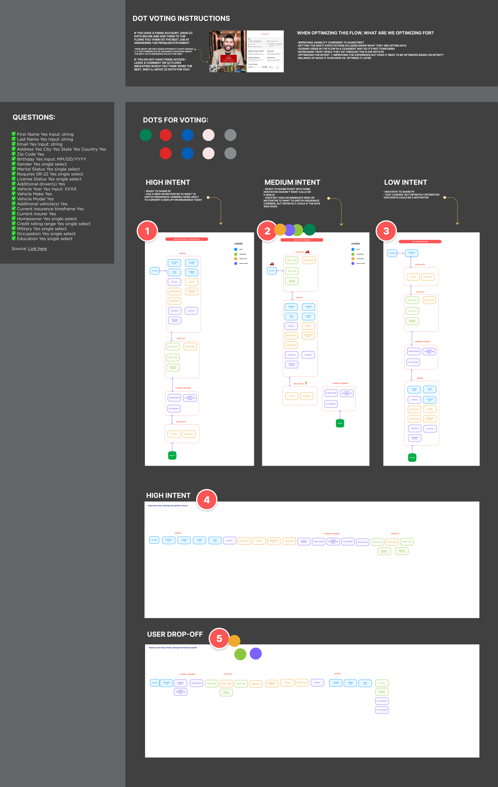
Intent-based segmentation and the two flow strategies, with the team dot-voting exercise
A Reusable Question-Template System
A flow with more than 20 questions depends on consistency. Rather than design screens one at a time, I built a small system of question templates on top of NerdWallet's design system, each with documented rules for when to use it:
The patterns
- Normal question: the default for most fields, phrased as a plain second-person prompt ("What kind of vehicle would you like to insure?") so the ask stays unambiguous, with a progress bar, optional eyebrow and helper text, and a clear CTA.
- "Mad Libs" question: first-person, inline inputs ("I drive a ___") for moments where a more conversational framing lowers the friction of answering.
- Interstitial / confirmation: used only in longer flows to set expectations for what's coming and confirm progress mid-flow. These carry no progress bar, since their job is reassurance rather than measurement.
The payoff
Each pattern was built for both desktop and mobile and reused NerdWallet's existing components, including navigation, input and select states, primary buttons, and progress. The payoff was leverage. Any question could be assembled from a known pattern, the flow stayed visually and behaviorally consistent, and engineering had an unambiguous contract to build against.
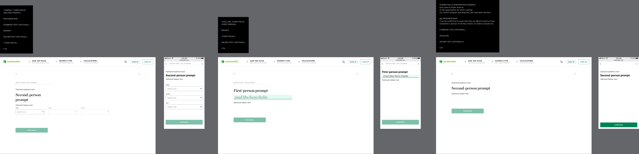
Question-template system: Normal, Mad Libs, and Interstitial patterns
Aligning a Crowded Room
This initiative touched more than ten stakeholders across Business Development, Category, Content, CRM, Performance Marketing, Biz Ops, User Ops, Legal, and Data Platform, each with a stake in what shipped.
Two moves kept it from stalling:
How I kept it moving
- A structured decision instead of a debate. Rather than argue flow options in meetings, I ran a dot-voting exercise directly on the flows in Figma, anchored to the problem statement. People placed votes, or left comments, on the flows they felt best answered Eddie's need. It turned a sprawling set of opinions into a clear, shared signal.
- Designing with Legal rather than around them. Because users were leaving NerdWallet for carrier sites, we needed disclosures clarifying this wasn't a NerdWallet-provided quote. I treated that constraint as part of the experience and built the required disclosure into the flow's expectation-setting instead of bolting it on at the end.
The Solution
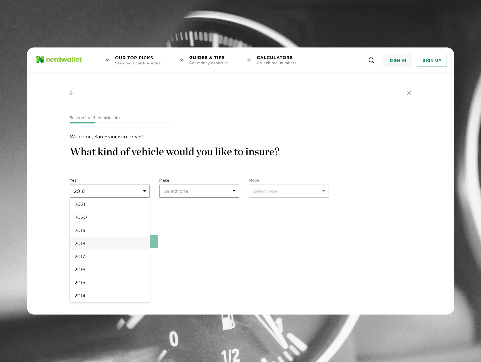
The redesigned flow leads with the question a car-insurance shopper expects first, their vehicle, under NerdWallet's own brand, with clear "Section 1 of 4" progress so people always know how much is left.
Underneath that simplicity, information NerdWallet already knew was pre-filled, every step's answers persisted so users could leave and come back, and sensitive questions carried short context explaining why the information was needed and how it would be used. The whole experience handed a complete profile to top carriers so Eddie could shop across several of them without re-entering anything.
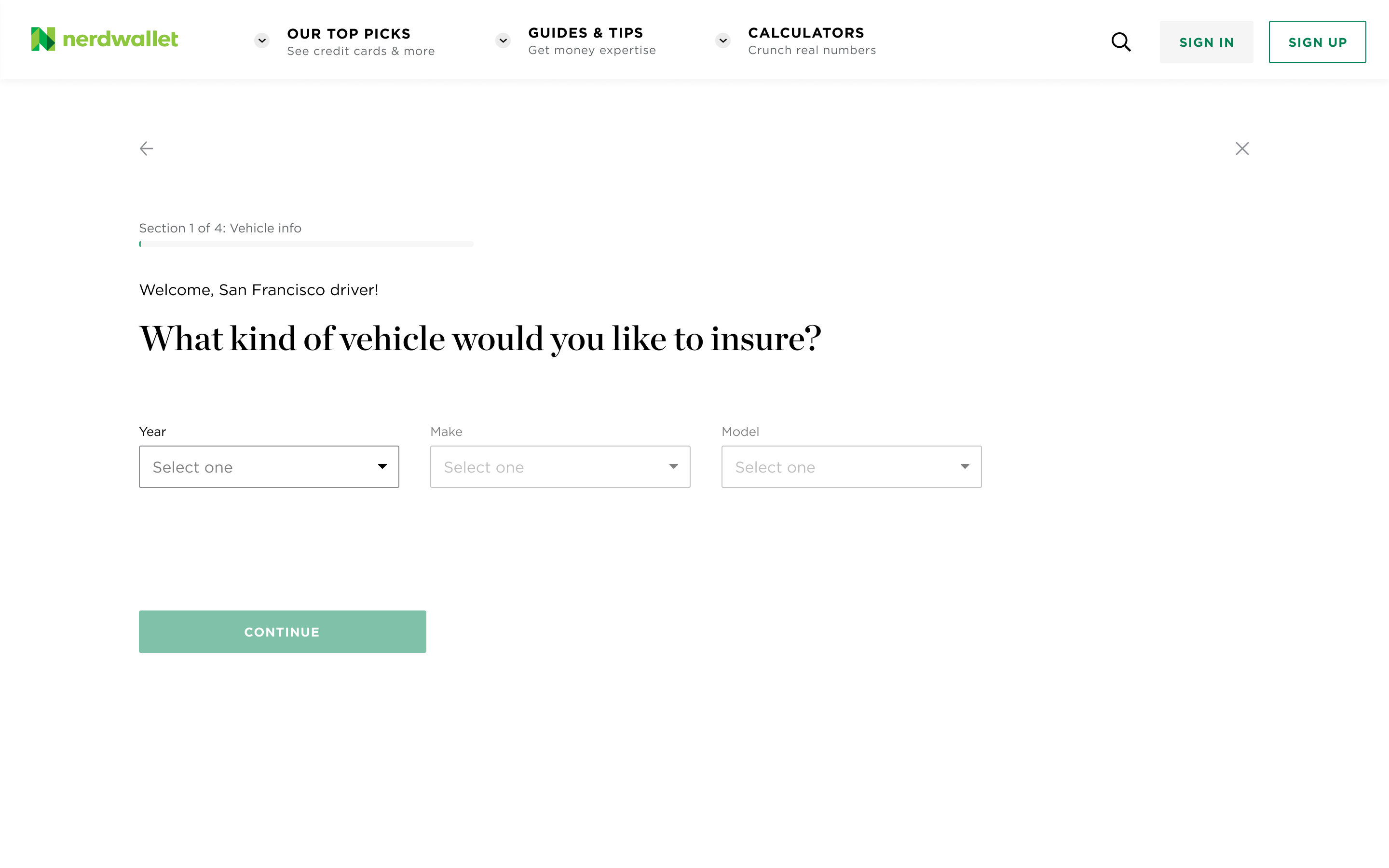
The redesigned NerdWallet flow, opening on a logical first question with clear progress
Iterating on Live Data
The work continued after launch. A/B testing and early post-launch data showed users abandoning the flow before finishing, so I reordered the question sections to remove the friction that was costing completions.
The reorder targeted three points where the flow was losing people. Each change maps to one of them, with the reasoning behind it:
What I reordered, and why
| Where the flow lost people | What I changed | Why it works |
|---|---|---|
| Sensitive questions came too early. The "Driver Info" section (name, date of birth, address, license details) sat at the start, asking for the most personal data before the user had answered anything easy or seen any payoff. | Moved the entire "Driver Info" section from the beginning of the flow to the end. | We had bet that clear context messaging would make an early PII ask acceptable, but the data showed explanation alone wasn't enough. People share PII far more readily once they are invested and a result is in sight, so moving the section to the end put the highest-friction ask at the highest-trust moment and removed the early wall that was driving abandonment. |
| A dense section stalled people mid-flow. Driving-history questions were bundled into a broader section, making some steps long and effortful right in the middle of the journey. | Split the questionnaire from four sections into five, giving driving history its own focused section. | Smaller, single-purpose sections lower the effort of any one step and create clearer progress milestones, so the flow feels shorter and momentum holds through the middle. |
| An interstitial broke momentum. A mid-flow interstitial added a screen with nothing to complete, lengthening the flow without moving the user forward. | Removed the interstitial screen. | Every screen without a clear job is a place to drop out. Cutting it shortens both the real and the perceived length of the flow. The pattern still exists in the system for genuinely long flows; the data showed this one did not need it. |
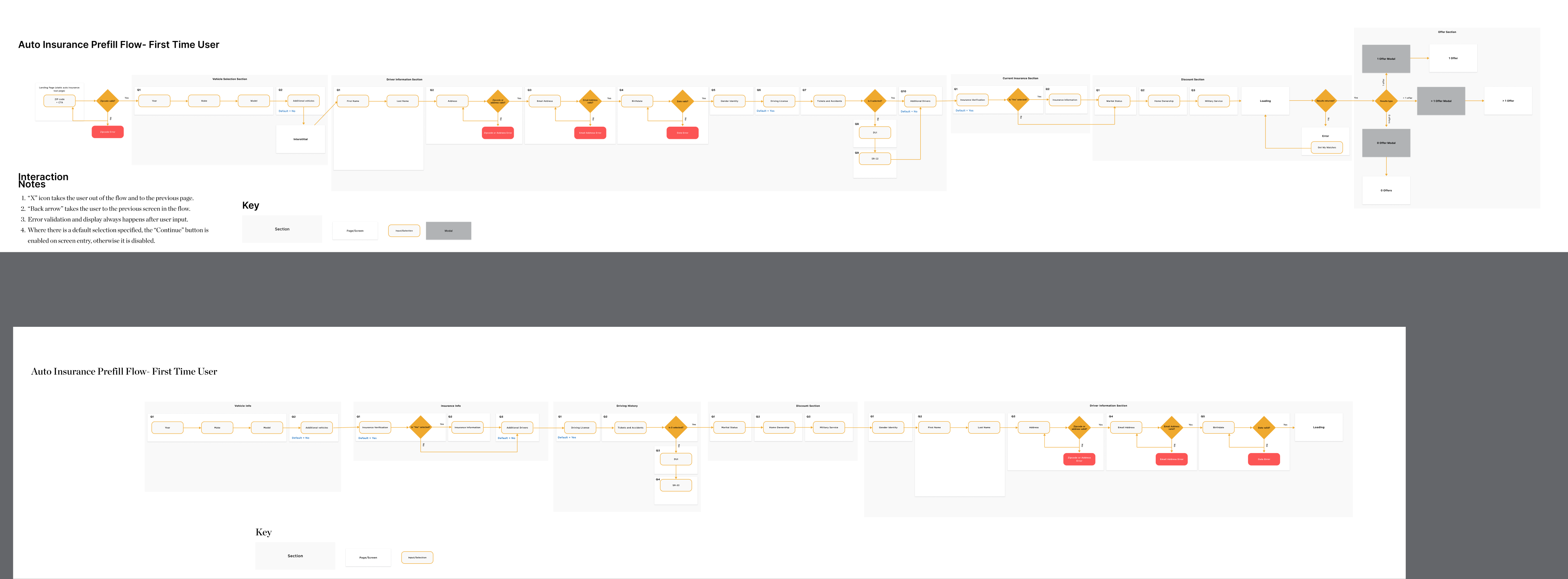
The full flow before and after the reorder
Bringing it back to the strategy
All three changes pull in the same direction as the broad-to-specific strategy we had put into market: open with low-friction, on-topic questions about the car, and hold sensitive personal details until the end. The first version that shipped placed the Driver Info section earlier than that principle pointed, on the bet that context messaging would offset the friction. The live drop-off data showed explanation alone wasn't enough, so I brought the flow back in line with the original intent. Shipping that change is what moved the two-strategy bet from a hypothesis to a result.
Impact
It shipped, and after iterating on live data, it beat the bar. We set out to match the incumbent Quinstreet experience on ARPV. The redesigned, NerdWallet-native flow did better:
Results
| Metric | Goal | Result |
|---|---|---|
| Performance (ARPV) | Parity with Quinstreet | +20% over Quinstreet |
| Conversion (reaching results and clicking through to carriers) | Beat Quinstreet | 60%+ |
Beyond the numbers
- The question-template system was adopted into NerdWallet's design system and reused across other insurance products, including home, life, and renters. A flow built for one vertical became shared infrastructure for the org.
- Expanding a narrow pre-fill brief into a full redesign, reframed around trust and sequencing, is what turned the work from a like-for-like port into a measurable revenue win.
- Putting two ordering strategies into market, instead of picking one in a meeting, let the data make the call.