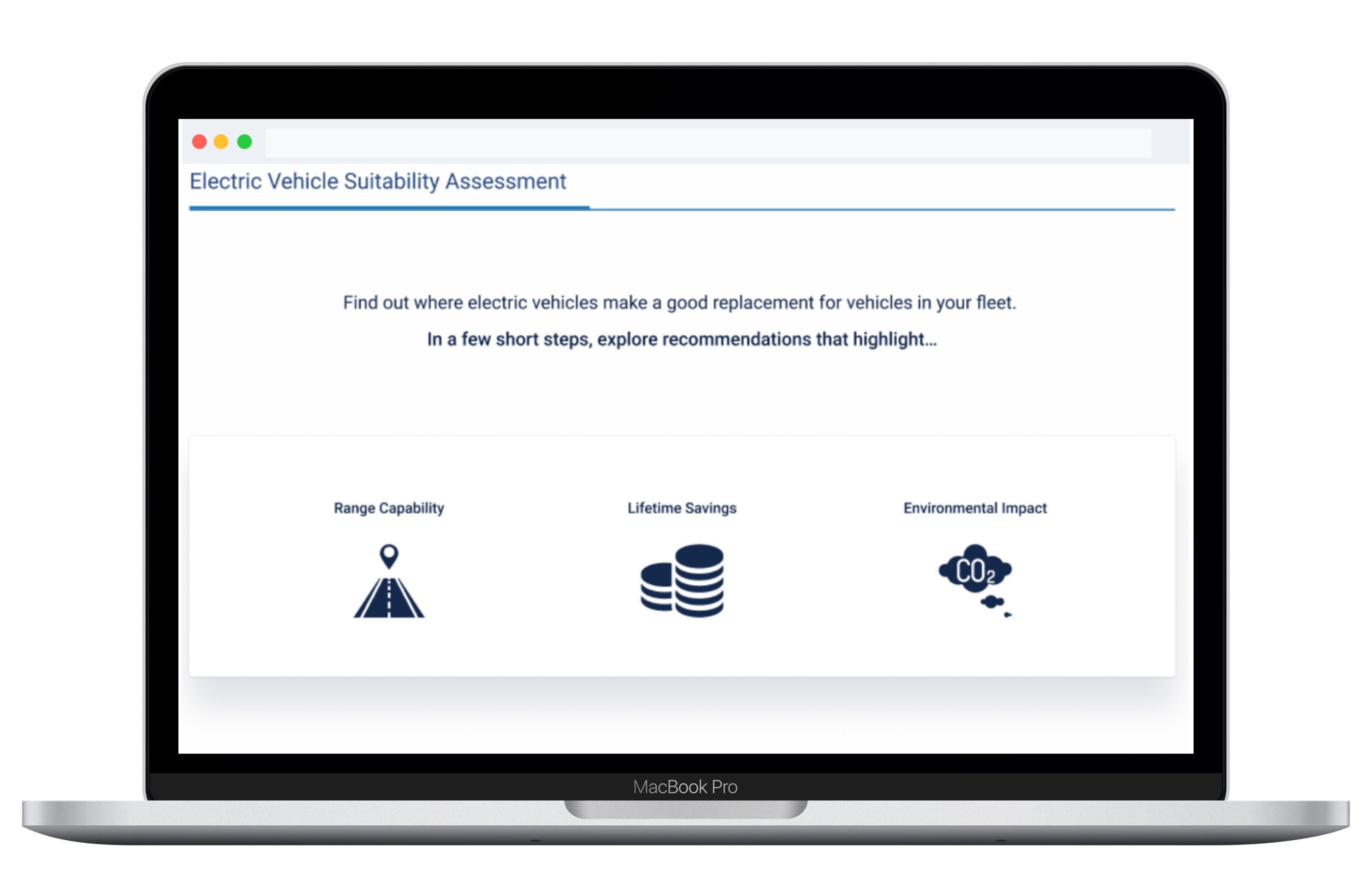
Electric Vehicle Suitability Assessment (EVSA)
I led design on a self-service tool that uses a fleet's own telematics to recommend which vehicles can switch to electric. It launched in Europe and North America and scored 79 on the SUS.
At a Glance
| Timeline | March to November 2019 (about 8 months) |
| Role | Lead Product Designer (sole designer on the product) |
| Team | 1 PM, 1 designer (me), 4 engineers |
| Domain | Fleet electrification, telematics (Geotab) |
| Outcome | SUS 79 · Positive NPS · Launched in Europe and North America |
Overview
Fleet managers wanted to switch to electric but didn't have data they could trust. The options out there needed expensive consultants and gave shaky recommendations built on manufacturer spec sheets that didn't reflect real driving.
I led the design of EVSA, a self-service tool that looks at a fleet's actual telematics data and recommends EVs based on how the vehicles really get driven, the weather they run in, and total cost of ownership.
The Solution
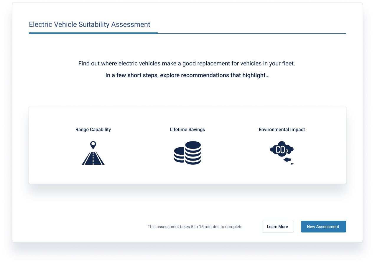
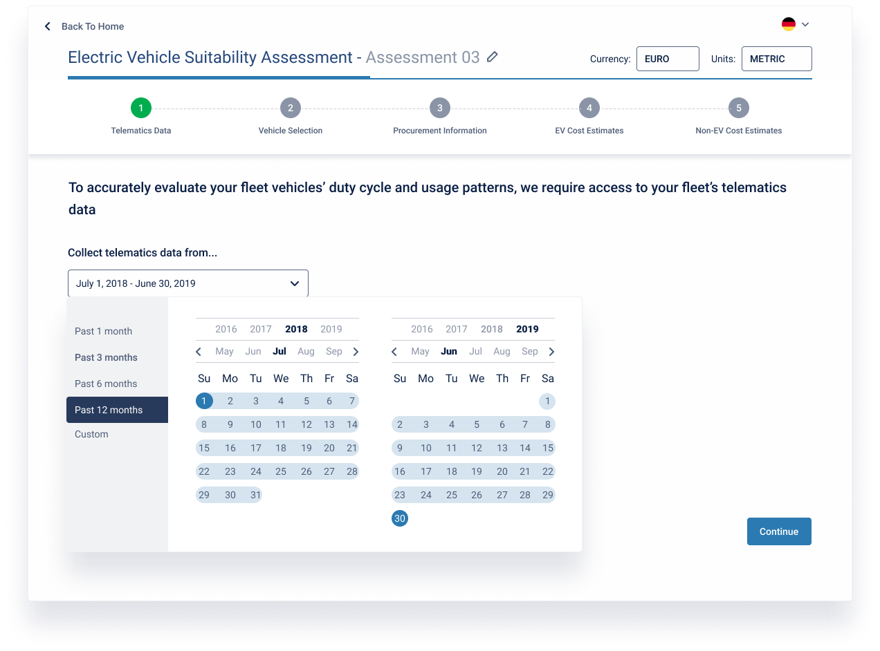
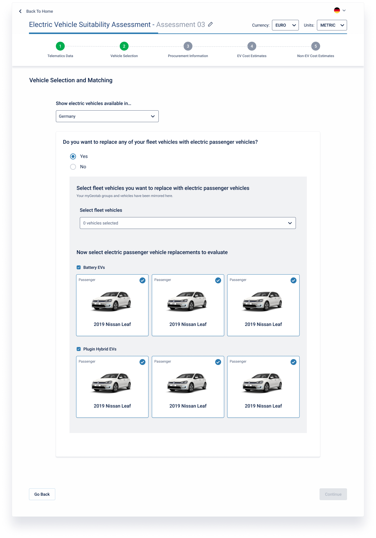
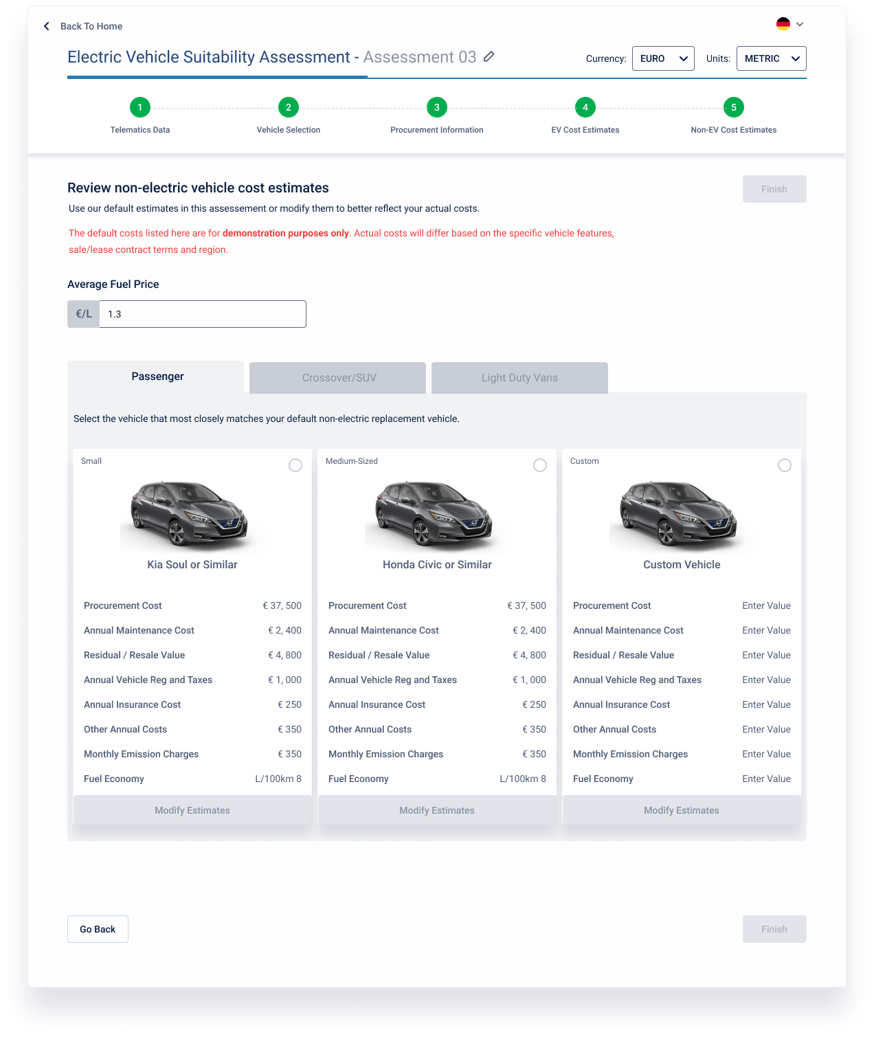
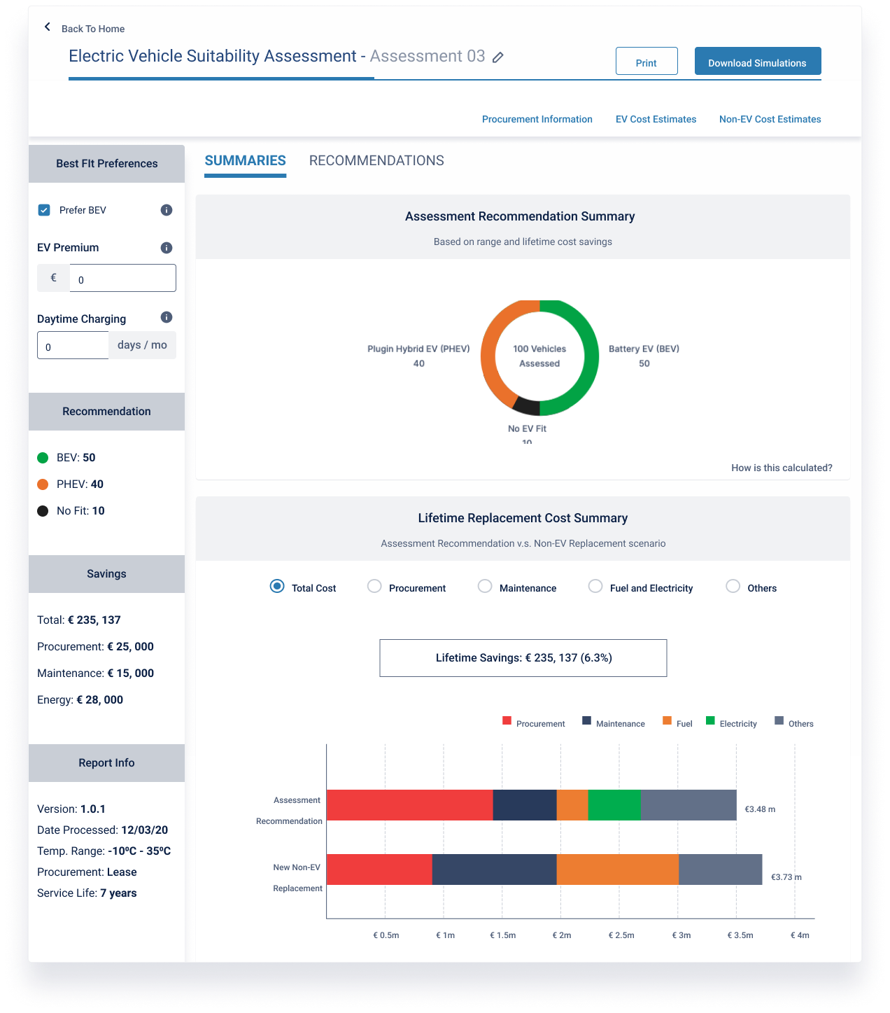
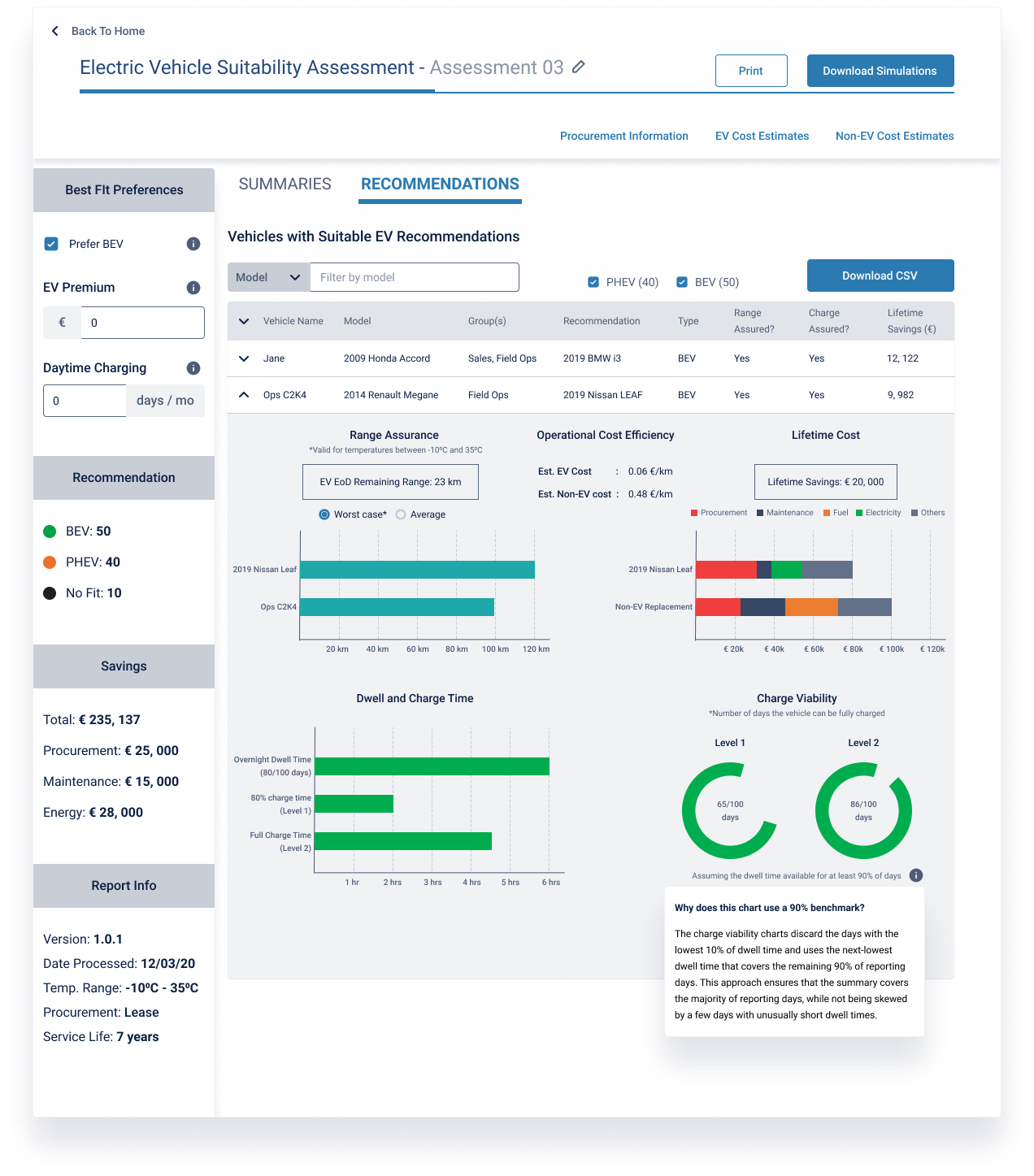
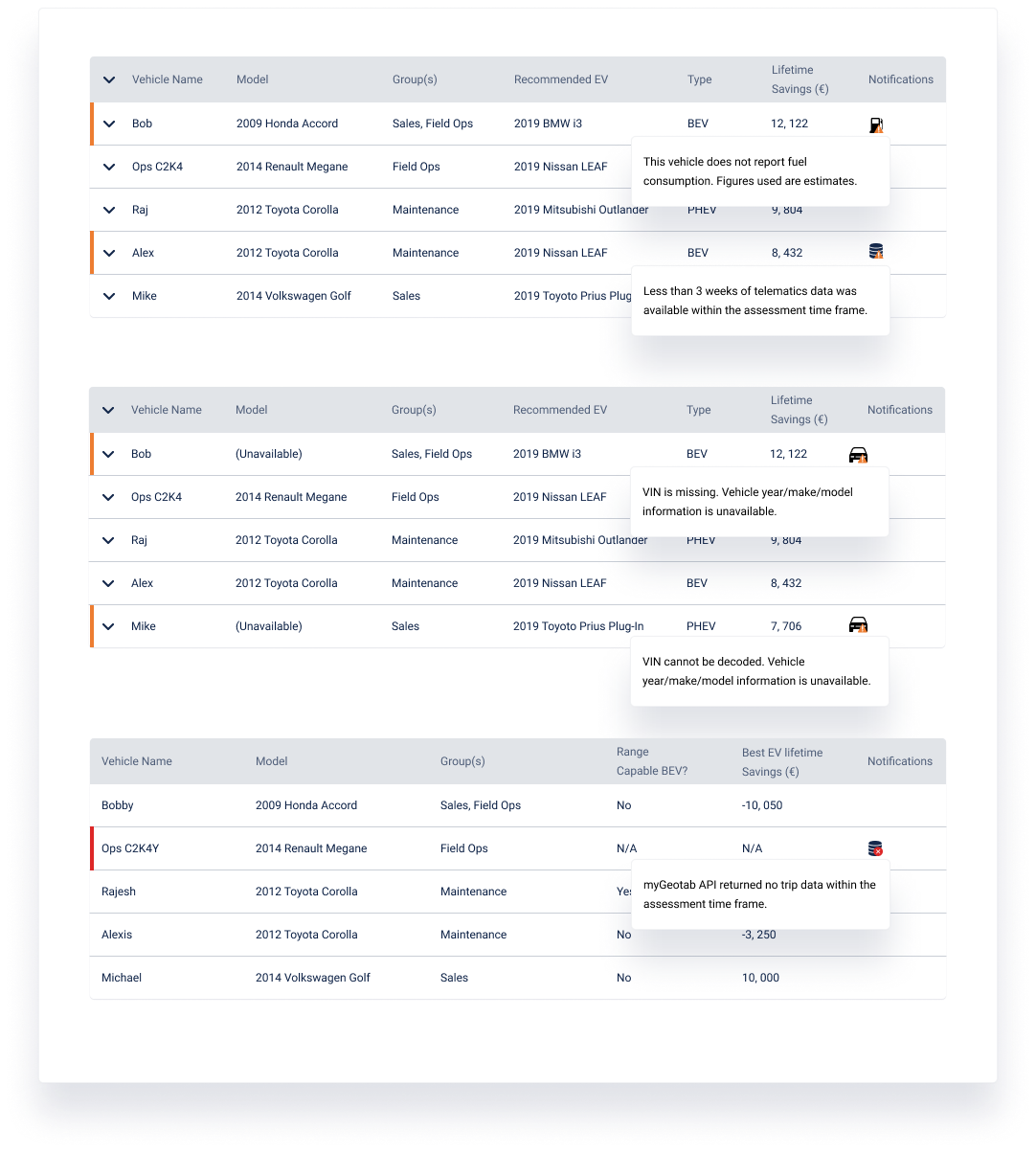
EVSA takes a fleet's real telematics data and turns it into clear EV recommendations in three steps.
Key Screens
My Role & Ownership
Owned
- Design strategy: principles, research synthesis, success metrics
- Interaction design: IA, flows, wizard pattern
- UI design: visuals, layouts, data visualization
- Usability research: 10 sessions, synthesis, prioritization
Influenced
- Reframed the product from a comparison tool to recommendations-first
- Set up a way for PM and design to work together (later used across the EV product org by 3 PMs)
- Got UX success metrics defined before launch, which the team had not done before
Collaboration
- PM on prioritization and metrics
- Engineering (4) on system architecture and feasibility
- Broader product and engineering team members on critiques
Reframing the Product Strategy
The original PRD positioned EVSA as "an EV comparison tool." That framing was wrong.
After more than 15 hours of customer interviews, it was clear people didn't want to compare options themselves. They wanted to be told which EVs would work. They didn't have the time or the trusted data to do that analysis on their own.
The user story
“As a fleet manager, I want to quickly and accurately evaluate replacing my fleet with functionally equivalent EVs, so I'm better informed to advise stakeholders.”
What this changed
That changed the information architecture. Instead of side-by-side comparisons, we'd lead with a clear recommendation and back it up with evidence.
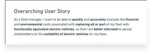
Overarching user story
Design Principles in Action
The PM had already validated the problem and tested some solution concepts before I joined. What the team didn't have was a shared picture of what a good solution looked like. People were optimizing for different things.
I pulled together the user story, the design requirements, and what I'd learned about the user into five principles we could point to when we had to make a call:
1. Trust over everything
2. Clarity and transparency over minimalism
3. Direction over choice
4. Accuracy over comprehensiveness
5. Function over form
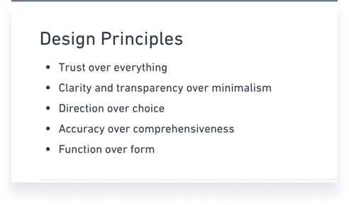
Five design principles
Putting the Principles to the Test
These principles got tested right away. Our main users were efficiency-driven fleet managers, and they were blunt about it: they didn't have time to run this evaluation themselves. That bumped up against our principle of clarity and transparency over minimalism.
My first attempt leaned on clarity
My first home screen leaned hard on clarity. I wrote two screens of explanatory text covering how the tool worked, what data it needed, and what you'd get out of it. People scrolled right past it looking for "Start." The text I thought was helping was just getting in the way.
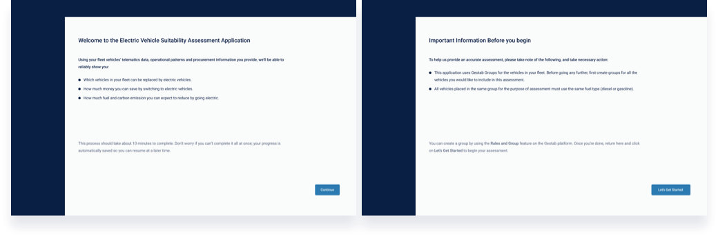
First home screen, heavy on explanation
Mapping the questions users actually had
To figure out what people actually needed to know before starting, I mapped their thoughts and worries at each step. A few specific questions kept coming up: how long is this going to take, what do I get at the end, and can I save and come back to it.
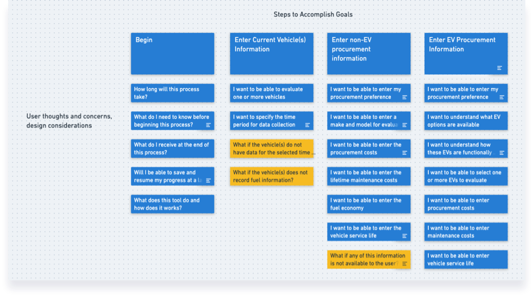
Task flow annotated with users' thoughts and concerns
The final home screen
So I cut the explanation down to the three questions people actually asked before starting, and answered them in a small space at the top of the screen.
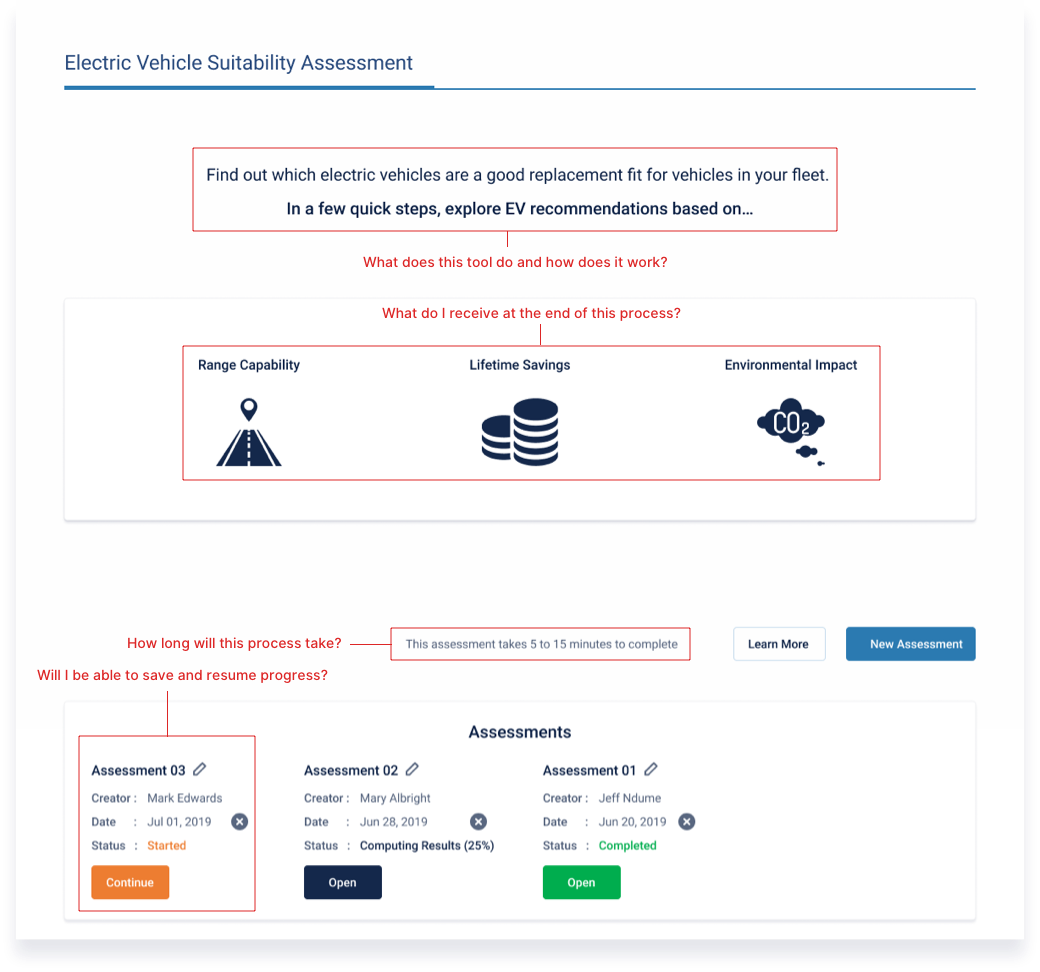
Final home screen, annotated
Reducing Complexity
The same tension showed up in the setup flow. The first version had eight screens just to get the user's location. That's a lot of screens and decisions before anyone could even start the assessment.
I took it to a team critique. We agreed it was too much friction, so I went through each step and asked whether we actually needed it, or whether we could get the same information some other way.
From 8 screens to 3
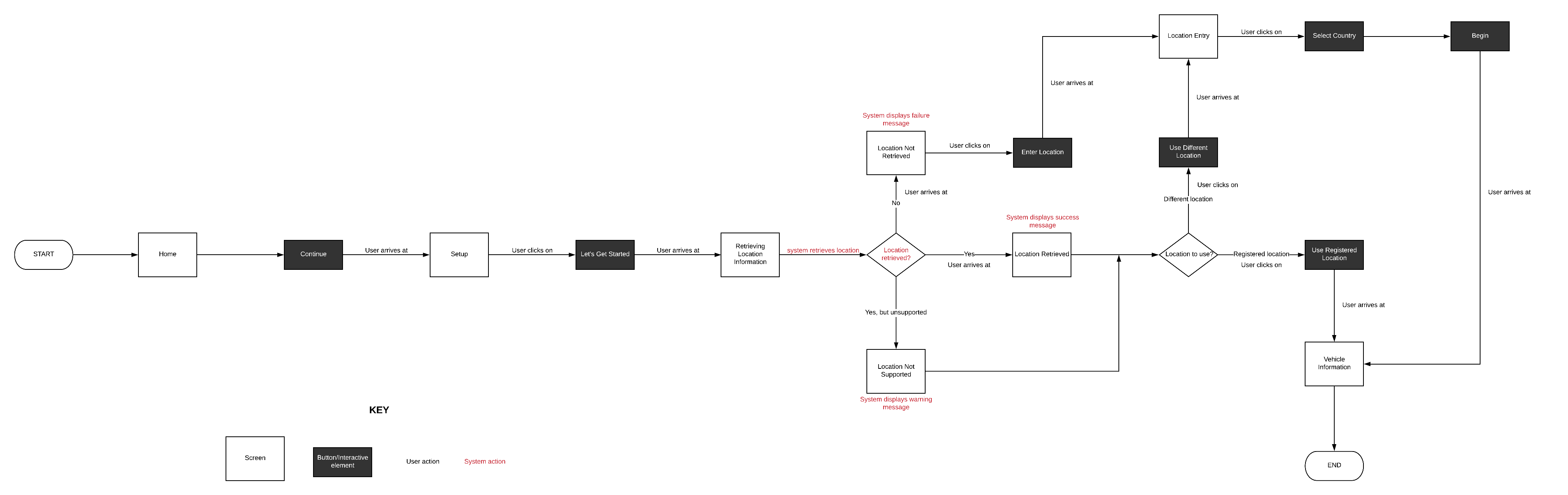
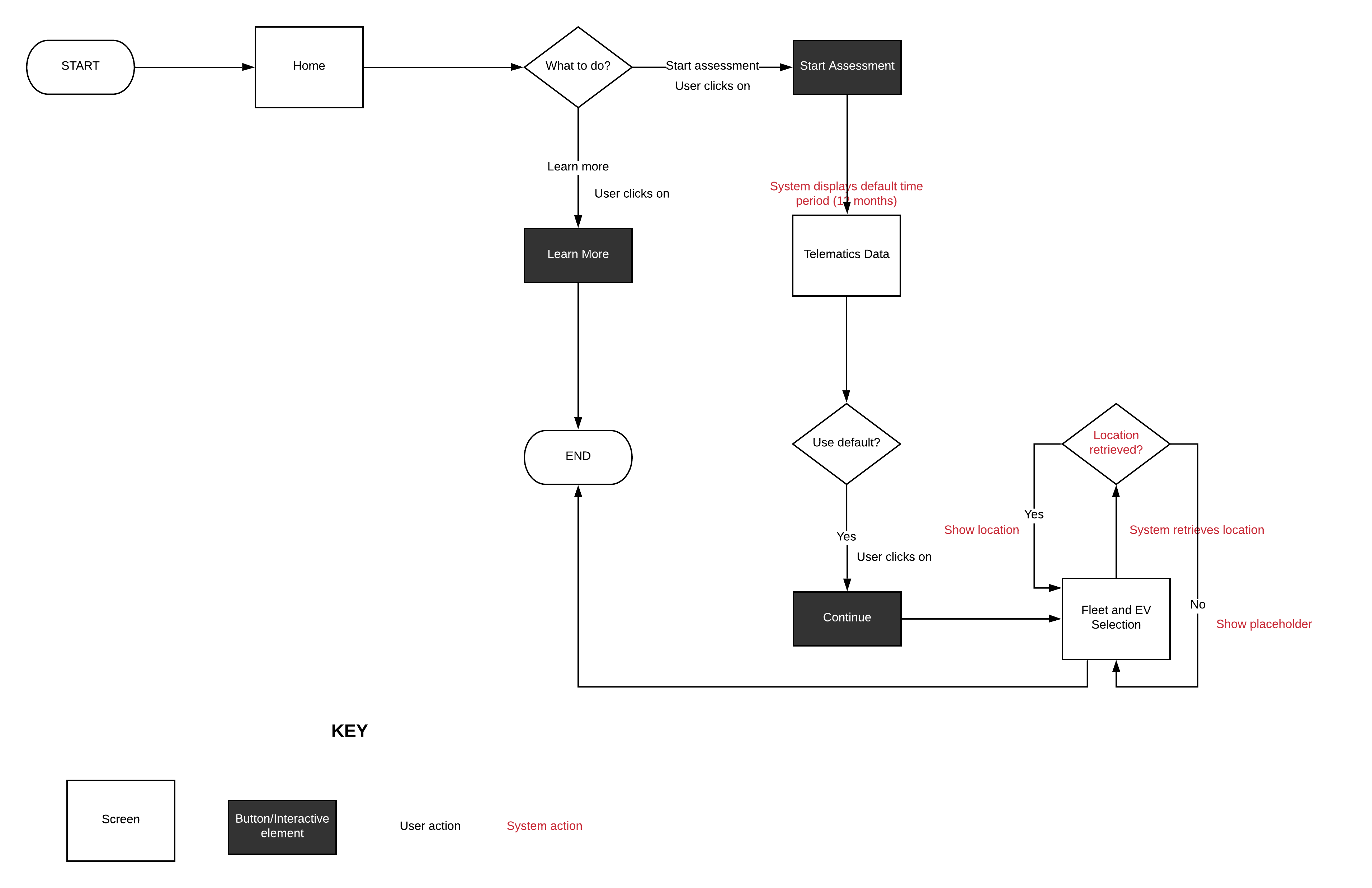
What we cut
- Auto-detect location rather than asking for manual entry
- Use smart defaults that users could override if needed
- Cut confirmation dialogs that weren't protecting against real errors
Result
We got it down to three screens.
Working with the PM
I was the first designer on the product. The PM had been working with engineering, but there wasn't a clear way for design to plug in.
So I proposed a simple model for who owned what at each stage:
How we split the work
- Product owns: hypotheses, problem validation, solution validation
- Design owns: user research, UX strategy, experience mapping, design, usability testing
- We share: design sync, critique, scoping, feature elaboration
The outcome
It made the day-to-day a lot smoother. The model ended up spreading across the EV product org, and three PMs now use it as their default.
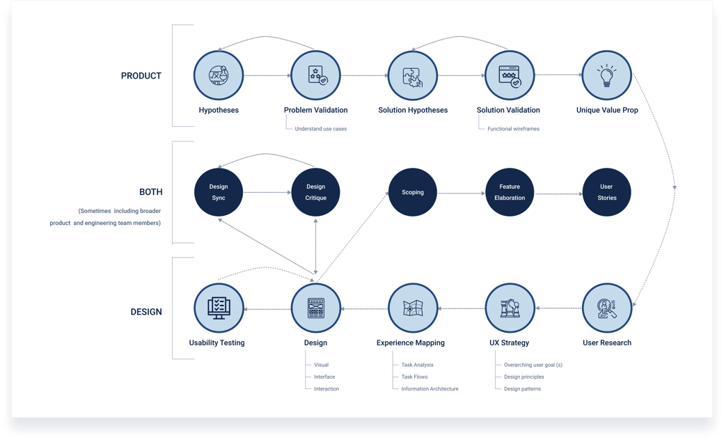
How the PM and I split the work
Usability Testing
Before launch I wanted to be sure the design actually held up with real users. I ran usability tests with 10 people across both of our user types: efficiency-driven and sustainability-driven fleet managers.
What we found
| Issue | Users | Insight |
|---|---|---|
| Selected only BEVs, ignored PHEVs | 9/10 | "Plug-in hybrids aren't, like, full EV" |
| Couldn't find fleet vehicle dropdown | 4/10 | "I saw EV pictures and went right to them" |
| Difficulty locating a specific vehicle | 3/10 | "I was looking for the Kia Soul and couldn't find it" |
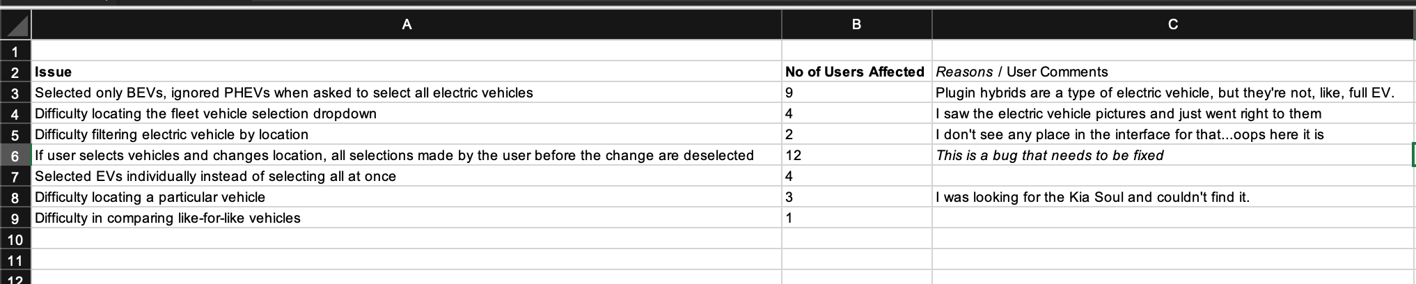
Usability test synthesis
What the issues told us
The PHEV problem was really a wording problem. People didn't think of plug-in hybrids as real EVs. The dropdown problem was about visual hierarchy: the EV photos pulled attention away from the fleet list.
Prioritization
I put together an impact-effort matrix and ran a prioritization session with the PM and engineering to sort out what to fix before launch and what to push to the roadmap. We came out at a SUS of 79 against a target of 68, which told us the core design was working even with these issues left to clean up.
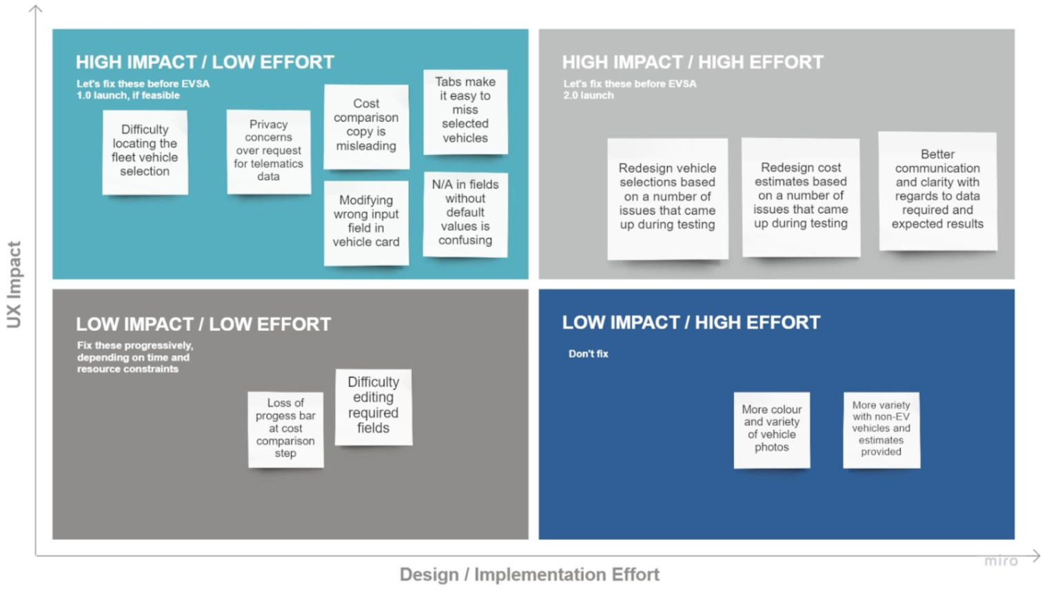
Impact-effort prioritization matrix
Success Metrics
Before this project the team only tracked business metrics. I pushed to add UX metrics too, and worked with the PM to set targets using Google's HEART framework:
Results against targets
| Metric | Target | Result |
|---|---|---|
| SUS | > 68 | 79 |
A new practice
After this, the team started setting UX metrics alongside business metrics at the start of a project.
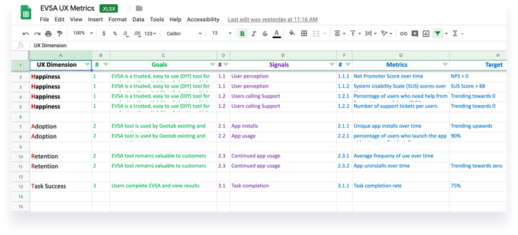
UX metrics, mapped to the HEART framework
Impact
EVSA shipped, and it held up on both the experience side and the business side.
Product Launch
- Launched first in Europe, then North America
- Hit a SUS of 79, above the target of 68
Business Impact
- Brought in new enterprise customers, especially in Europe where commercial EV adoption is further along
- Turned into one of the sales team's go-to tools
Team Impact
- The PM-and-design working model spread across the EV product org (3 PMs)
- Setting UX metrics before launch became a normal part of how the team works
Stakeholder Feedback
“Multiple folks in Europe give compliments about how intuitive and clear the EVSA flow was.”
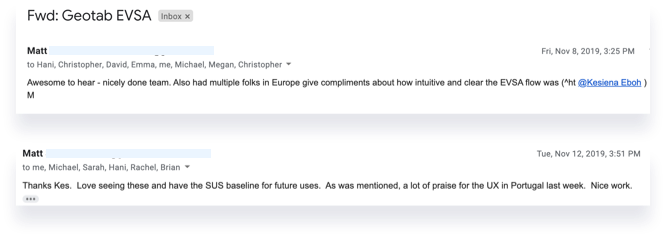
Post-launch feedback